

01.
Reviewing a legacy brand
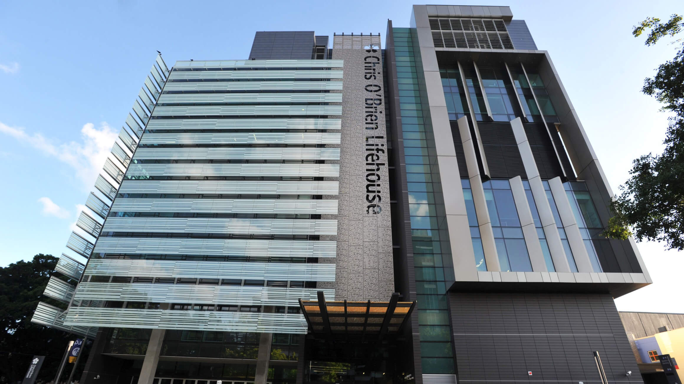
Chris O’Brien had a strong brand presence, however the overall brand documentation was extensive and confusing for internal team members to implement on a daily basis. In addition, it was not originally designed with the extent of digital application that we take as standard for brand identities today. We begun by talking with the team on their needs and reviewing every asset available.

02.
Optimising the brand
Some elements of the identity such as the ‘star of hope’ device, were fundamental to the brand’s recognition. We worked closely to determine how we could bring about the change the team needed without impacting the equity that these distinctive assets had built over time. For the ‘star of hope’, we revised the shape, creating more balanced geometry and revealing the star at the centre more clearly through negative space. This then helped with recognition on smaller applications. We then rebalanced the typesetting of the wordmark to give 'Chris O’Brien' more prominence and introduced a more vibrant green that felt both modern and digital.


In addition to this, we simplified the overall colour palette, reduced the number of logo variations, improved visual accessibility through higher contrast and created a handscript tagline, giving the team a steer on how to apply it in context.
03.
Delivering the brand
We took the board through the changes to the logo and wordmark, as it was a treasured and much-respected symbol. Once finalised, our guidelines were delivered at half the length of the previous document yet containing everything the team would need for day-to-day application.

We’re excited to see the refreshed identity being rolled out and look forward to cheering Chris O’Brien Lifehouse on as they continue their inspiring and deeply important mission.


