The design process is changing. Here's how our product design process adapted.

Francesco de Chirico
March 15, 2026
3
min read
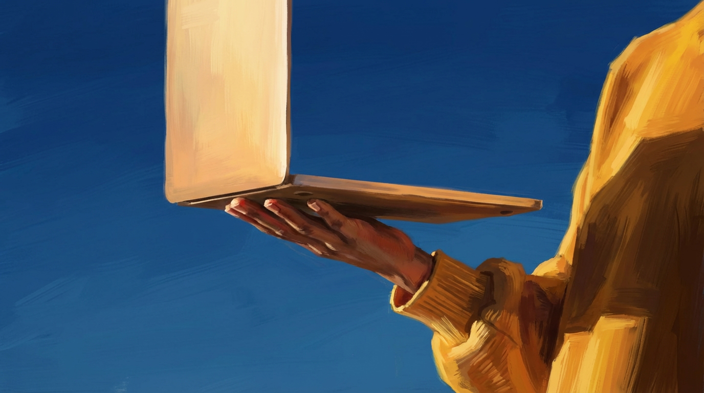
Every week there's a new model. A new tool. A new capability that changes what's possible. OpenAI ships something. Anthropic ships something. The pace is not slowing down.
Somewhere in all of that noise, a reasonable question keeps coming up: if AI can build software, does design still matter?
More than ever.
When anyone can ship a product, the thing that separates the ones people use from the ones they don't is how it feels. That's product taste — the judgment calls about what to show, what to hide, how something flows, and why it works. The founders and teams who obsess over that will win this era. The ones who treat design as a skin on top of AI-generated output won't.
Software is becoming a commodity. Product taste is the moat.
We've been doing product and brand design for over 20 years. We've watched tools come and go. None of them changed what design fundamentally was. AI is different — not because it replaces the work, but because it collapses the cost of exploration so dramatically that the entire sequence has shifted.
The order matters now. The tools matter less.
Here's what that looks like in practice.
Start with chaos
Every project begins with too much information and not enough clarity. Founder calls, stakeholder interviews, product briefs, competitive research, half-formed ideas. The difference now is you don't need to spend days organising all of that before you start working.
Dump it. Transcripts, notes, voice memos, raw documentation. Straight into AI. Unstructured, unfiltered. Let it parse the mess while you focus on asking better questions. Lowest friction wins.
Scope with AI
Use AI as a research partner — not to get answers, but to sharpen the questions. It asks things you hadn't considered. You describe the problem and in doing so, understand it better.
Kick off subtasks: competitor analysis, comparison tables, preliminary information architecture. AI is good at finding haystacks that might contain needles.
At this stage, you're not designing. You're scoping. And scoping well is half the battle — especially for founders who are time-poor and need to make fast decisions about what to build.
Build it badly on purpose
AI is terrible at design. Not UI in the superficial sense — it can generate something that looks like an app. We're talking about real design: application structure, affordances, microcopy, the relationship between information and interaction. The stuff that makes something feel intuitive rather than just look complete.
But a terrible build is a better starting point than no build.
Start from a functionally sound but poorly designed prototype, then tear it down. The cost to rework bad decisions used to be prohibitive. Not anymore. You can rebuild ten times in a day. The job is to find what's trying to emerge from the mess.
For founders: this is where AI prototyping gets genuinely valuable. You can test ideas, show investors, and validate direction before committing real engineering time.
Creative direct the hell out of it
Put on the creative director hat and shoot holes. No constructive sandwich. Just: "This is wrong. This shouldn't exist. Why is this here?"
AI is a maximalist. It throws colours, chips, icons, and cards everywhere — vomiting UI components across the page. To an untrained eye, it looks like a product. To someone with product taste, it's noise. Stripping it back to signal now costs almost nothing.
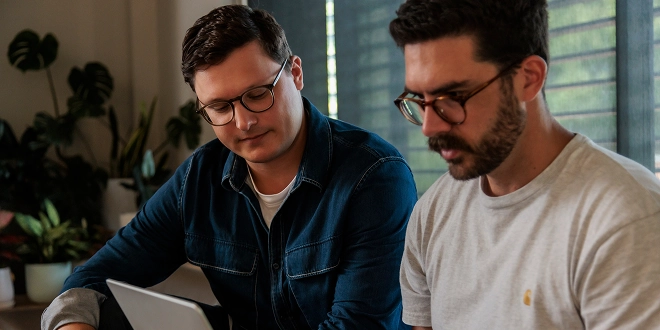
This is where having someone with real design experience matters. Not to make it pretty — to make it clear.
Refine, then recognise the ceiling
Push the prototype as far as it'll go without traditional design tools. Refine the IA, nail the interaction patterns, make it feel functionally real.
But there's a ceiling. Text and voice as design mediums are too imprecise. You can't polish iconography through conversation. Every time you introduce new functionality, AI forgets elements that already exist and bloats the prototype with inconsistencies.
It's tempting to stay in this phase forever. Don't. The ceiling will never be high enough for a product people pay for. Use it for stakeholder feedback, investor demos, and team alignment — then move on.
Gut it. Save the context.
Throw away the code and keep only the thinking. Clean markdown files — context, constraints, architectural decisions — that inform the next build. Screenshots of every state, every edge case. No code. Just knowledge.
This step sounds counterintuitive but it's critical. The first build is research. The second build is the product.
Figma and craft
This is where most design processes used to start. Now it's step seven. And it's still indispensable. This is where product taste lives.
Auto layout. Design tokens. Typography scales. Colour systems. Component reuse. After AI-assisted progress, this feels slow. But it's where something goes from functional to considered. From "this works" to "this feels right."
You need far fewer screens than you used to — the ideation has already happened. But the output is higher polish than anything AI can generate on its own. That gap between AI-generated and human-crafted? That's the moat. That's where product taste shows up. That's what users feel, even if they can't articulate why.
Build it again, then hand off
Take the design files and start a clean build with precision. The Figma-to-AI translation layer is still underpowered — screenshots alone aren't enough. But it's getting closer.
Then hand off to a real developer. Performance, APIs, production-grade code, understanding what else is in flight — all of this requires engineering with real context. Prototypes are better than ever, but they're still prototypes. For products handling real users and real money, you need an engineer you trust.
For marketing sites and lightweight builds? Ship it yourself. For anything with complexity, don't pretend AI is a substitute for proper engineering.
What's actually changed
The process is still design. The difference is the order of operations and the cost of exploration. Weeks of early-stage ideation compress into days. You arrive at craft with more context and conviction. You hand off prototypes that are closer to the real thing than static mocks ever were.
Parts of this will probably feel outdated by the time you read it. That's not a weakness, that's the pace now.
But product taste doesn't expire. Understanding problems deeply, solving them with clarity, and crafting experiences people actually want to use — that becomes more valuable as software gets cheaper to build, not less.
Software is the commodity. Product taste is the moat.

