
6 Brand Design Trends Shaping 2026 (And How to Use Them)

Francesco de Chirico
June 10, 2026
8
min read
TL;DR: Most "brand design trends" lists are just recycled Pinterest boards with new labels. We've filtered the noise down to six shifts that actually matter in 2026 — and we're honest about which ones you should adopt, which to watch, and which to skip entirely. Don't chase trends for the sake of it. Pick the ones that serve your brand strategy.
Every January, design blogs publish their predictions for the year ahead. By March, half of those predictions have already been forgotten. By mid-year, we're all just doing the same work we were doing before — only now with a slightly different colour palette and a vague sense of guilt about not being "on trend."
Here's the thing: brand design trends 2026 aren't wildly different from 2025. The tools are evolving. The conversation is shifting. But good brand design still comes down to the same fundamentals — clarity, consistency, and a strategy that actually means something.
At UntilNow, we work with Australian businesses that don't have the luxury of chasing every shiny new direction. They need brand identities that work hard, last longer than a trend cycle, and connect with real people.
So instead of a breathless roundup, here's our honest, opinionated take on the six brand design trends that are genuinely worth your attention in 2026.
1. AI-Generated Brand Assets
What's happening
AI image generators — Midjourney, DALL-E, Adobe Firefly, and a growing list of others — have moved from novelty to daily workflow. According to a 2025 McKinsey report, 72% of organisations have adopted AI in at least one business function, up from 55% the year prior (McKinsey, 2025). In design specifically, teams are using AI to generate mood boards, explore visual directions, produce social media assets, and prototype brand concepts faster than ever.
Australian agencies and in-house teams are no exception. You'll find AI-generated textures, patterns, and imagery across everything from startup pitch decks to retail campaigns.
Brand examples
- Coca-Cola ran its "Masterpiece" campaign using a mix of AI-generated and traditional art, sparking industry debate about authorship and originality.
- Canva (Sydney-born, globally scaled) has baked AI generation directly into its platform, making it accessible to every small business owner in Australia.
- Heinz used DALL-E to generate "what AI thinks ketchup looks like" — and turned the results into a clever campaign that leaned into imperfection.

How to apply it
Use AI for the messy, early stages of exploration. It's brilliant for generating 50 visual directions in an afternoon, testing colour combinations, or building rough mood boards. It's not brilliant for producing final brand assets that need to be original, legally defensible, and strategically on-point.
UntilNow's take
Use AI for exploration, not final output. We use AI tools in our brand strategy and ideation process — they're genuinely useful for getting unstuck and widening the creative aperture. But the moment you hand your logo, key visuals, or brand identity to a generator and call it done, you've got a brand that looks like everyone else's AI-generated brand. There are also real questions about copyright, ownership, and originality that haven't been resolved. AI is a sketch tool. Treat it like one.
2. Anti-Minimalism and Maximalist Brands
What's happening
The decade-long reign of "clean, minimal, sans-serif everything" is loosening its grip. Brands are getting louder. Bolder colour palettes, expressive and layered typography, dense textures, illustrated elements, and unapologetically busy layouts are showing up across industries — from FMCG to fintech.
This isn't new. Design trends are cyclical. But the 2026 version of maximalism is more intentional than the chaotic grunge aesthetics of the early 2000s. It's structured excess — brands using visual complexity to stand out in feeds, on shelves, and in environments where attention is the scarcest resource.
A 2024 study from the Design Management Institute found that design-driven companies outperformed the S&P 500 by 211% over a ten-year period (DMI, 2024). Distinctive, expressive brands are part of that equation.
Brand examples
- Guzman y Gomez (Australian-founded) has leaned into bold, vibrant brand expression with hand-drawn type and high-saturation colour that stands out in food courts and on delivery apps.
- Oatly pioneered the "anti-corporate" maximalist look — hand-lettered packaging, dense copy, and an irreverent tone that spawned a thousand imitators.
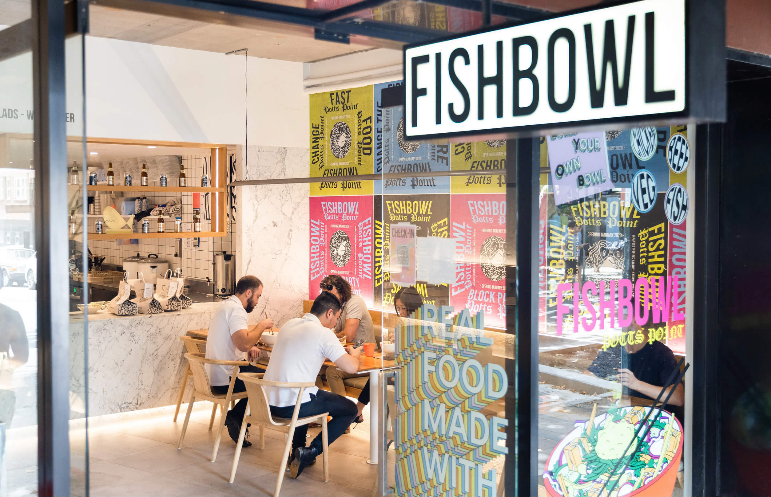
- Fishbowl (Sydney-based salad chain) uses rich colour blocking, textural photography, and playful typography that's anything but minimal.
How to apply it
If your brand has been sitting in the "white space + Helvetica" camp for a while, consider where controlled maximalism could add personality. That might mean introducing a secondary display typeface, expanding your colour palette, or adding illustrative elements. The key word is controlled — maximalism without a system behind it just looks messy.
UntilNow's take
Adopt — but with guardrails. We're fans of brands that aren't afraid to take up space. The trap is thinking "more is more" without any underlying logic. Every visual element should earn its place. If you're going maximalist, you need a stronger brand system than a minimalist brand does, not a weaker one. Complexity without structure is just clutter.
3. Motion-First Identity
What's happening
Brands are being designed to move first and sit still second. Where a static logo and a set of print guidelines used to be the foundation, the 2026 starting point is increasingly: "How does this identity behave in motion?"
This shift has been building for years, driven by the dominance of video-first platforms (TikTok, Reels, YouTube Shorts), digital-first brand touchpoints, and the simple reality that most people encounter your brand on a screen before they ever see it on paper.
According to Wyzowl's 2025 State of Video Marketing report, 91% of businesses use video as a marketing tool, up from 61% in 2016 (Wyzowl, 2025). Your brand identity needs to perform in that context.
Brand examples
- Optus (Australia) redesigned its identity around a fluid, animated visual system — the brand's "O" morphs, pulses, and responds to content, making it inherently motion-native.
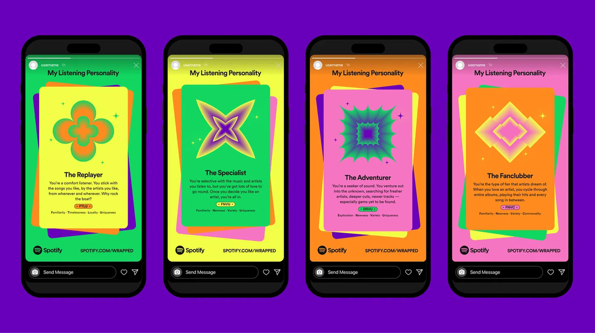
- Spotify has continuously evolved its brand expression around animation — dynamic album art, animated playlist covers, and the annual Wrapped campaign all treat motion as a core brand element.
- ABC (Australian Broadcasting Corporation) uses animated versions of its iconic Lissajous logo across streaming and social, adapting a legacy mark for motion contexts.
[IMAGE: Stills from animated brand identities showing logo transitions, motion graphics, and dynamic brand elements]
How to apply it
Start thinking about your logo's "behaviour" — not just how it looks, but how it enters, exits, transitions, and reacts. Even if you're a small business, consider how your brand appears in Instagram Stories, video intros, and website loading states. You don't need a Pixar-level animation budget. You need intentional motion principles built into your identity from the start.
UntilNow's take
Adopt — this one's not optional anymore. We've been designing motion into brand identities at UntilNow for a while now, and it's moved from "nice to have" to "table stakes." If your brand guidelines don't include motion principles — timing, easing, transition styles — you're designing for a world that doesn't exist anymore. That said, motion should feel like a natural extension of your brand's personality, not a bolted-on afterthought.
4. Brand Systems Over Brand Guidelines
What's happening
The traditional 40-page brand guidelines PDF — the one that lives in a shared drive and nobody reads — is being replaced by something more useful: living brand systems. These are flexible, modular toolkits that give teams the components and rules they need to create on-brand work without needing to check with a designer every time.
Think design tokens, component libraries, templated layouts, and documented decision-making frameworks rather than rigid "don't put the logo here" rules.
Lucidpress (now Marq) reported that consistent brand presentation across platforms can increase revenue by up to 23% (Lucidpress, 2024). But consistency doesn't come from locking everything down — it comes from giving people the right building blocks.
Brand examples
- Atlassian maintains one of the most well-documented public brand systems in tech — flexible enough for thousands of employees to create content that still feels distinctly Atlassian.
- Telstra (Australia) overhauled its brand system to be component-based and digitally native, reflecting the reality that most brand touchpoints are now screens, not print.
- Commonwealth Bank (Australia) built a design system that bridges brand and product, so the same visual language appears in marketing, app UI, and physical branches.

How to apply it
Audit how your brand actually gets used day-to-day. If people are constantly going off-brand or asking "is this okay?", your guidelines are too rigid or too vague. Build a system that's flexible enough to adapt to new channels and formats, but structured enough that on-brand work is the path of least resistance.
UntilNow's take
Adopt — this is how brand design should've always worked. We build brand identities as systems from day one. A logo and a colour palette aren't a brand — they're ingredients. The system is the recipe. If your brand can't flex across a social post, a pitch deck, a website, and a storefront without looking inconsistent or requiring a designer to hand-hold every step, it's not fit for purpose.
5. Inclusive and Accessible Design as Default
What's happening
Accessibility in brand design has moved from compliance checkbox to competitive advantage. Brands are designing for the full spectrum of human ability from the outset — not retrofitting after launch. This means sufficient colour contrast ratios, legible type at all sizes, alternative text strategies, inclusive imagery, and brand voice that doesn't exclude.
In Australia, one in five people has a disability (Australian Institute of Health and Welfare, 2024). Globally, the World Health Organisation estimates that 1.3 billion people experience significant disability. Designing for accessibility isn't a niche concern — it's designing for your actual audience.
The Australian Disability Discrimination Act (DDA) applies to digital services, and organisations that ignore accessibility are increasingly exposed to legal and reputational risk.
Brand examples
- Apple has long been the benchmark for accessible brand and product design, with features like Dynamic Type, VoiceOver, and colour filter options built into the core experience.
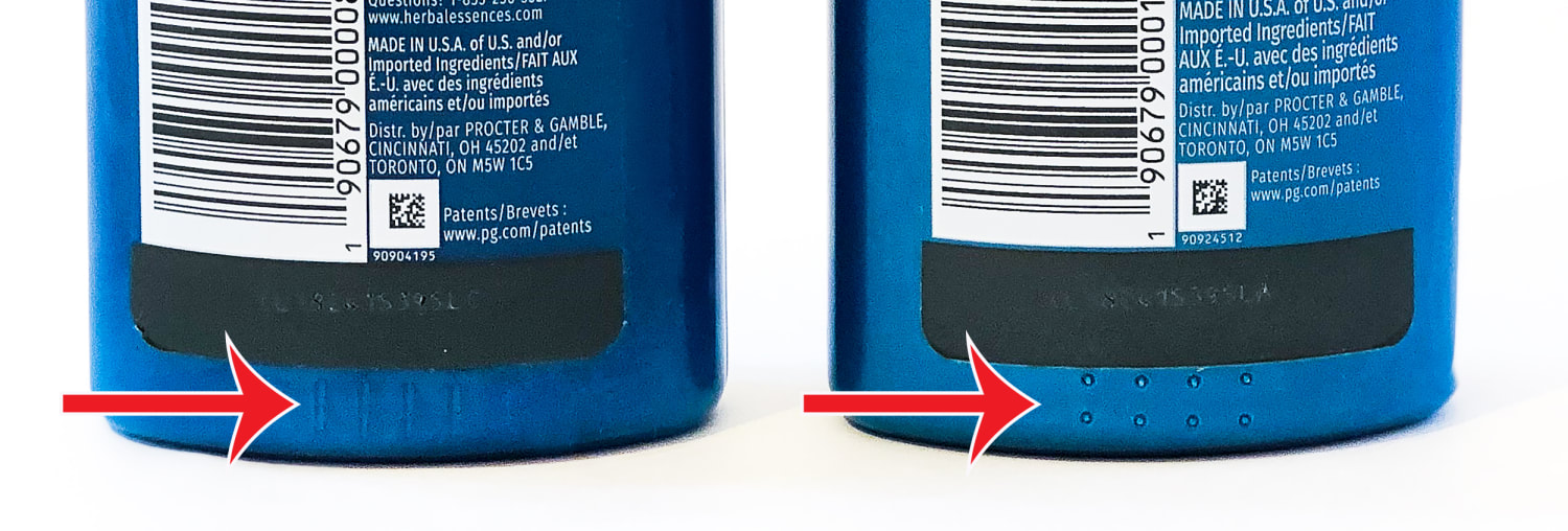
- Procter & Gamble redesigned packaging for brands like Herbal Essences with tactile indicators for visually impaired users — a small change with outsized impact.
- ANZ Bank (Australia) has invested significantly in accessible digital experiences and inclusive brand communications, including Auslan-interpreted content.
How to apply it
Check your brand's colour contrast ratios (WCAG AA minimum — a 4.5:1 ratio for body text). Review your typography for legibility at small sizes and on screens. Audit your imagery for representation. And think about your brand voice — does it assume a specific level of English literacy, cultural knowledge, or physical ability?
UntilNow's take
Adopt — and stop treating it as a separate workstream. Accessible design isn't a trend. It's a baseline. We bake accessibility into every brand identity project at UntilNow because designing for the widest possible audience isn't charity — it's good design. The brands that still treat accessibility as an afterthought are going to look increasingly out of touch. And in Australia, with the DDA and growing consumer expectations, they're taking an unnecessary risk.
6. Sustainability in Brand Design
What's happening
Brands are under more pressure than ever to communicate their environmental credentials. The problem? A lot of it is shallow. Green colour palettes, leaf icons, and vague claims about "sustainability" aren't fooling anyone anymore — especially not Australian consumers, who are increasingly sceptical of greenwashing.
The ACCC has been actively cracking down on misleading environmental claims. In 2025, they published updated guidance for businesses making sustainability claims, and several high-profile brands faced penalties for greenwashing (ACCC, 2025).
A 2024 Deloitte survey found that 64% of Australian consumers are willing to pay more for sustainable products — but only when they trust the brand's claims (Deloitte, 2024).
Brand examples
- Patagonia remains the gold standard — their brand design communicates sustainability through transparency (publishing supply chain data, worn wear programs) rather than just aesthetics.
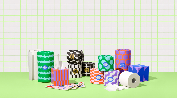
- Who Gives A Crap (Melbourne-founded) uses playful, colourful design to make sustainability approachable and joyful, rather than preachy or guilt-driven.
- Keep Cup (Melbourne-founded) built its entire brand identity around reuse without resorting to tired "green and earthy" clichés.
How to apply it
If your organisation has genuine sustainability commitments, communicate them with specificity — not platitudes. Use your brand design to make data and actions visible, not to wrap vague promises in eco-aesthetic window dressing. And if you're not there yet on sustainability, don't pretend you are. Consumers (and regulators) can tell.
UntilNow's take
Watch — and be honest about where you are. We help brands communicate their values visually, and sustainability is a big part of that conversation. But we'll always push back on clients who want to look sustainable without being sustainable. The design trends around sustainability in 2026 are moving toward transparency, specificity, and proof — not green leaves and recycled-paper textures. If you've got a real story to tell, tell it well. If you don't, focus on getting the substance right first, then we'll help with the design.
Trend Summary Table
How to Actually Use These Trends
Here's our honest recommendation: don't try to adopt all six at once.
Pick the one or two that align with your brand strategy and business reality. If you're a digital-first brand with no motion in your identity, trend #3 is your priority. If your brand guidelines are a dusty PDF from 2019, trend #4 is where to start. If you've been meaning to audit your colour contrast ratios for two years, stop meaning to and just do it.
Branding trends come and go. Brand strategy endures. The best thing you can do in 2026 is make sure your visual identity is built on a foundation that can adapt to whatever comes next — without needing a full rebrand every 18 months.
If you want to talk through which of these design trends 2026 actually matter for your brand, get in touch. We'll give you the same honest advice we've laid out here — tailored to your business, your audience, and your market.
FAQ
Are these brand design trends relevant for small Australian businesses?
Absolutely. You don't need a massive budget to apply these ideas. Motion-first thinking can start with simple animated social templates. Accessible design costs nothing extra when built in from the start. And brand systems actually save small teams time because they reduce decision fatigue. Scale the ambition to your resources, but don't ignore the direction.
Should we redesign our brand to follow the latest branding trends?
No. Chasing trends for the sake of it is one of the most expensive mistakes a business can make. A well-built brand identity should last five to ten years with minor updates. Only redesign if your current identity is genuinely underperforming, misaligned with your strategy, or unable to function across the channels where your audience actually encounters you.
How important is motion design for brand identity in 2026?
Very. With video accounting for the majority of social media content and digital touchpoints dominating brand interactions, an identity that only works as a static mark is incomplete. That doesn't mean every brand needs a cinematic logo animation — but having defined motion principles (timing, transitions, behaviours) is becoming standard practice for any serious brand identity project.
What's the difference between brand guidelines and a brand system?
Brand guidelines are typically a static document — a PDF that shows your logo, colours, fonts, and usage rules. A brand system is a living, modular toolkit that includes design tokens, component libraries, templates, and decision frameworks. Guidelines tell people what not to do. Systems give people the building blocks to create on-brand work independently. The latter scales; the former usually gathers dust.
Is AI going to replace brand designers?
Not in 2026, and probably not for a long time. AI is very good at generating volume and variation. It's poor at strategic thinking, cultural nuance, and making the kind of subjective creative decisions that make a brand feel like something. The designers who'll thrive are those using AI as one tool among many — not those pretending it doesn't exist, and not those handing over the creative decisions entirely.

