
01.
Finding clarity in complexity
We started with a 360° view of the company. We interviewed Ben the founder, senior staff, voice-of-customer experts and the company's investors. We ran brand strategy workshops and drafted manifestos, debated terminology and weighted how AI works alongside Dataweavers products. To be frank, Dataweavers was already differentiated in its powerful offering. The challenge was reframing it so it didn't feel like a blanket solution for everyone. Fortunately, there were clear lines we could draw.

.jpeg)
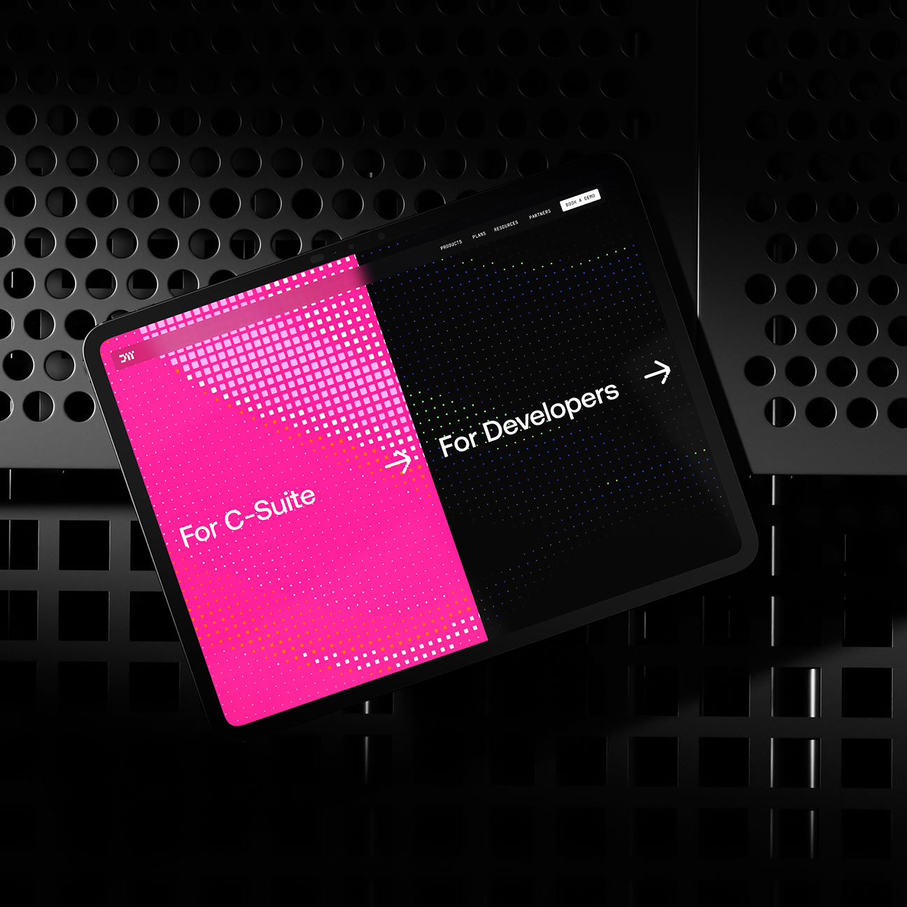
We decided that Dataweavers provided orchestration for digital experience platforms. The ability to both control and command your entire digital world. We identified two broad audiences: technical and non-technical, split by developer and c-suite roles. We then reframed the existing brand pillars to support a unified customer benefit: empowering organisations to do more meaningful work. With a clear line of logic threading who they are, what they do and how they do it, we shaped their brand personality as the 'rebel genius'. This conveyed Dataweavers' deep knowledge and refreshingly unorthodox approach. Now, we needed to bring it to life.
02.
A tapestry of nodes
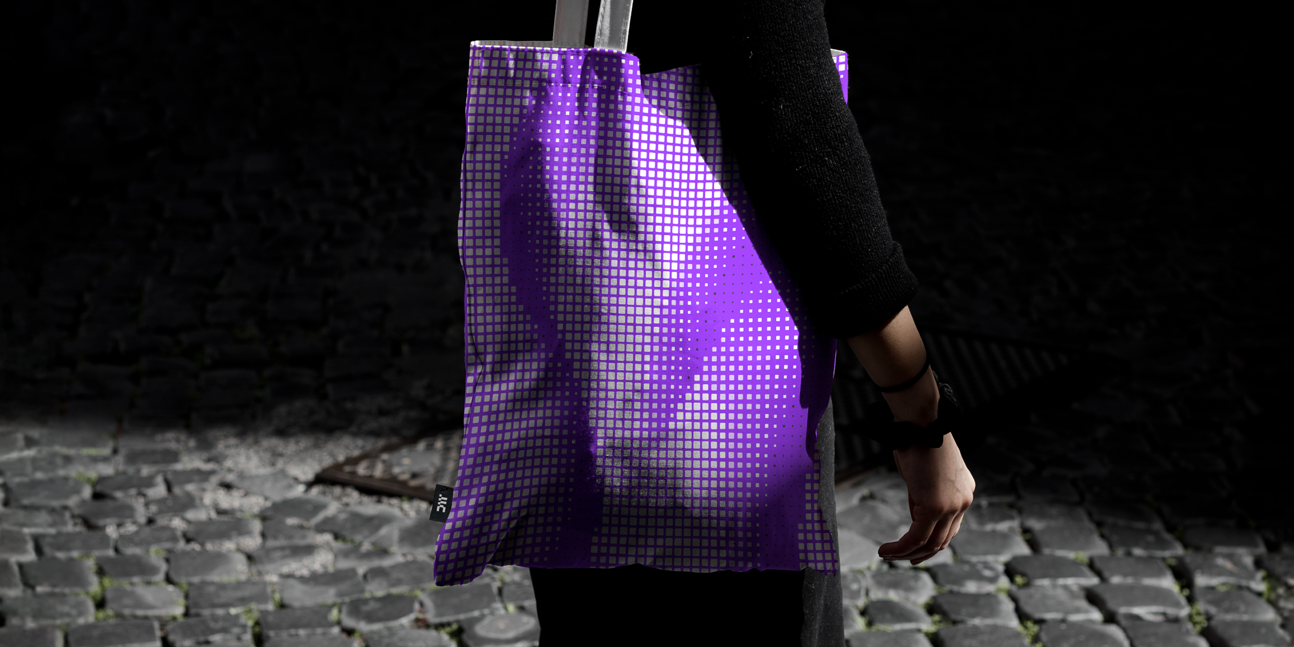
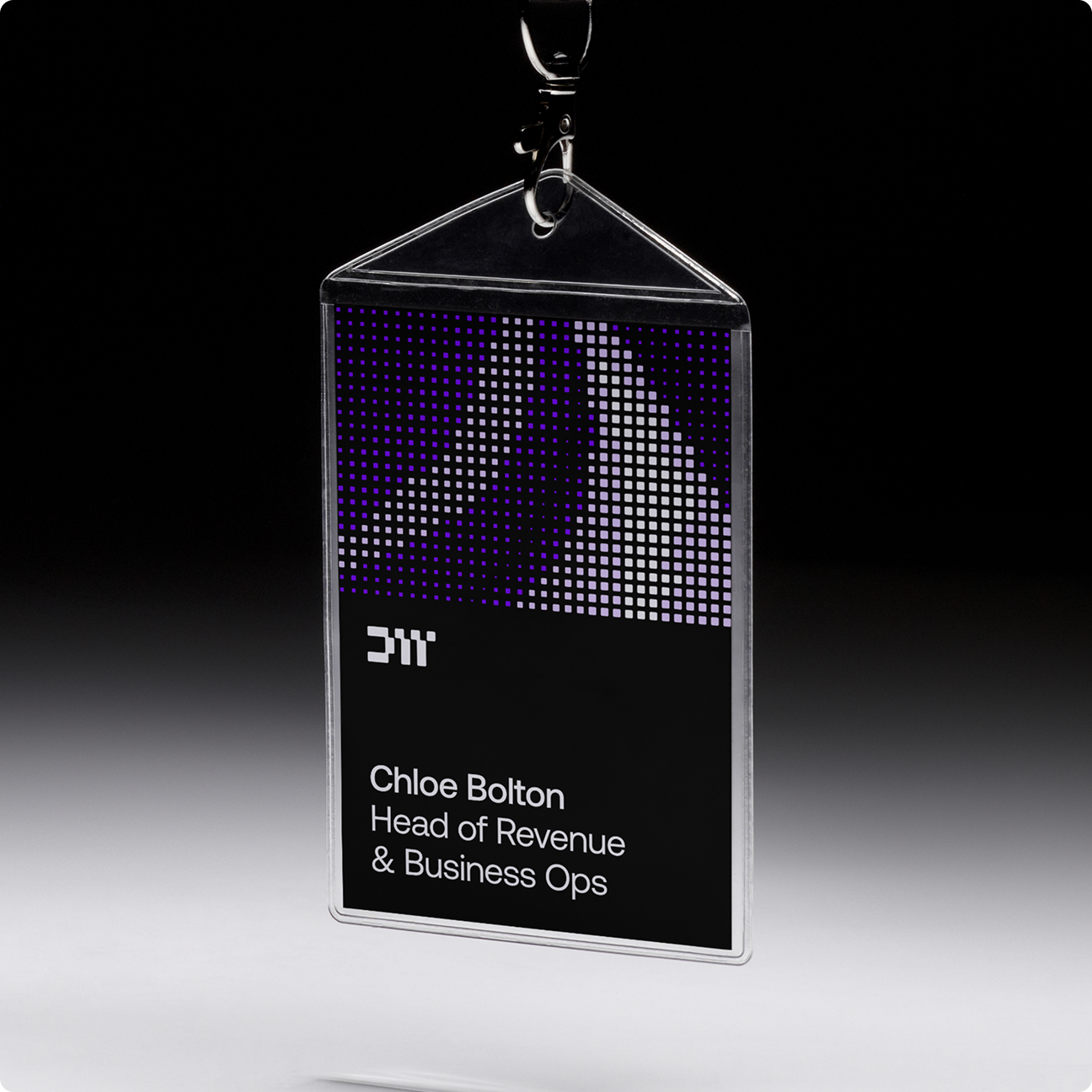
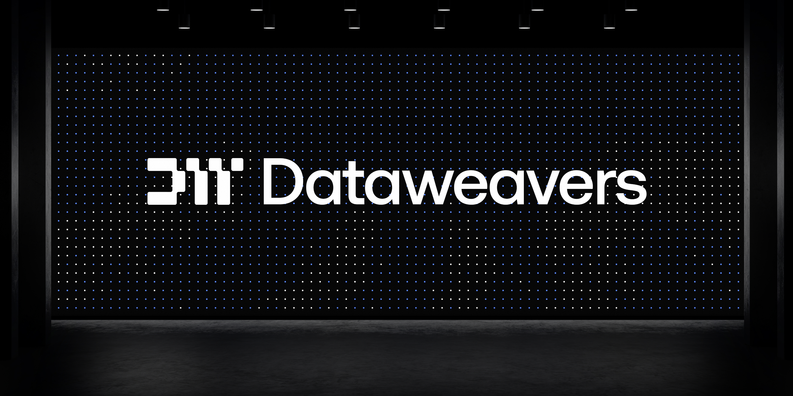
Dataweavers had no time for ‘snowflake’ solutions — fragile technical builds often done by outside agencies with little regard for longevity or integration. Instead, they see the whole picture, weaving through every part of the organisation. This informed the creative idea: a tapestry of nodes. We even built a pattern generator where custom imagery could be created in infinite variations.

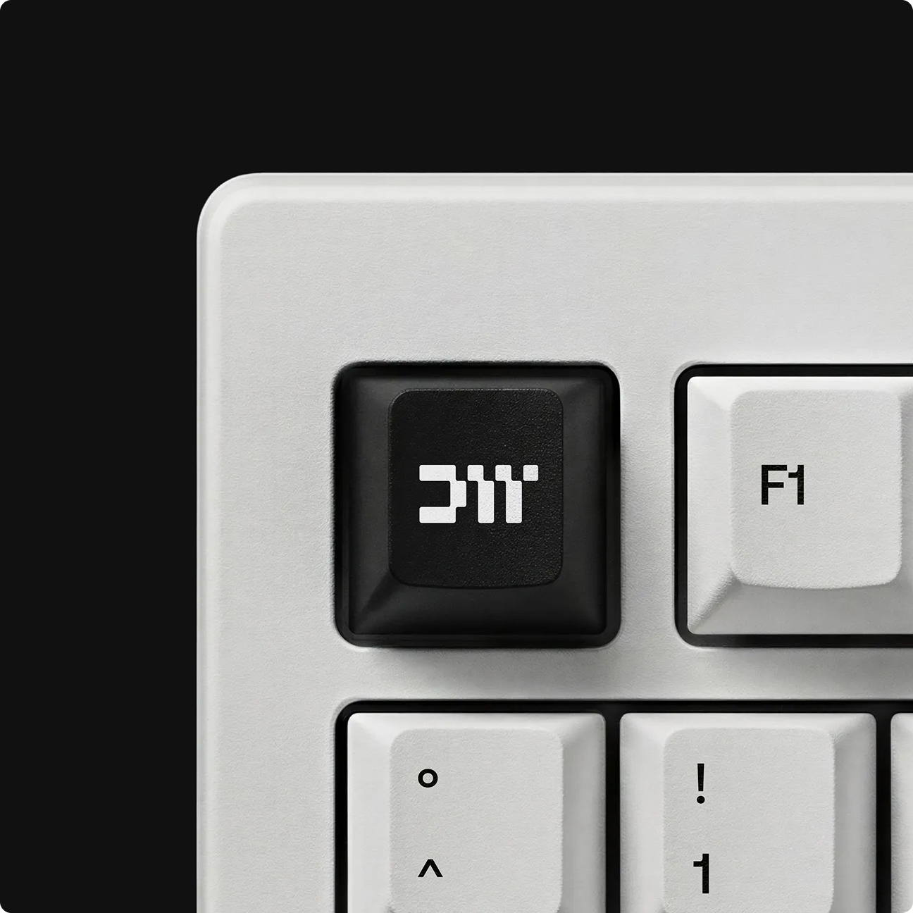
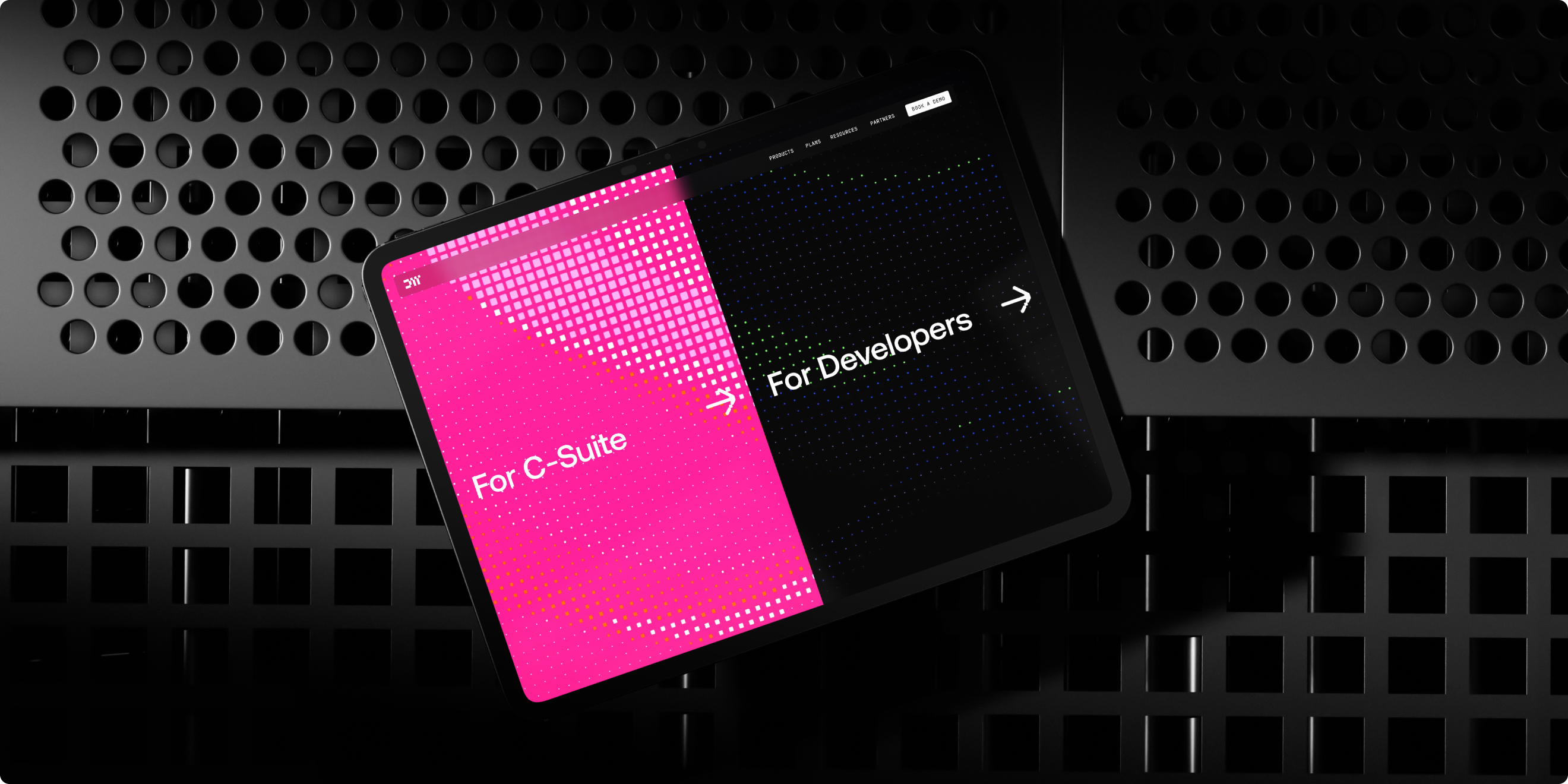
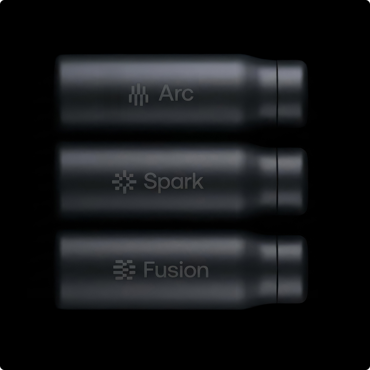
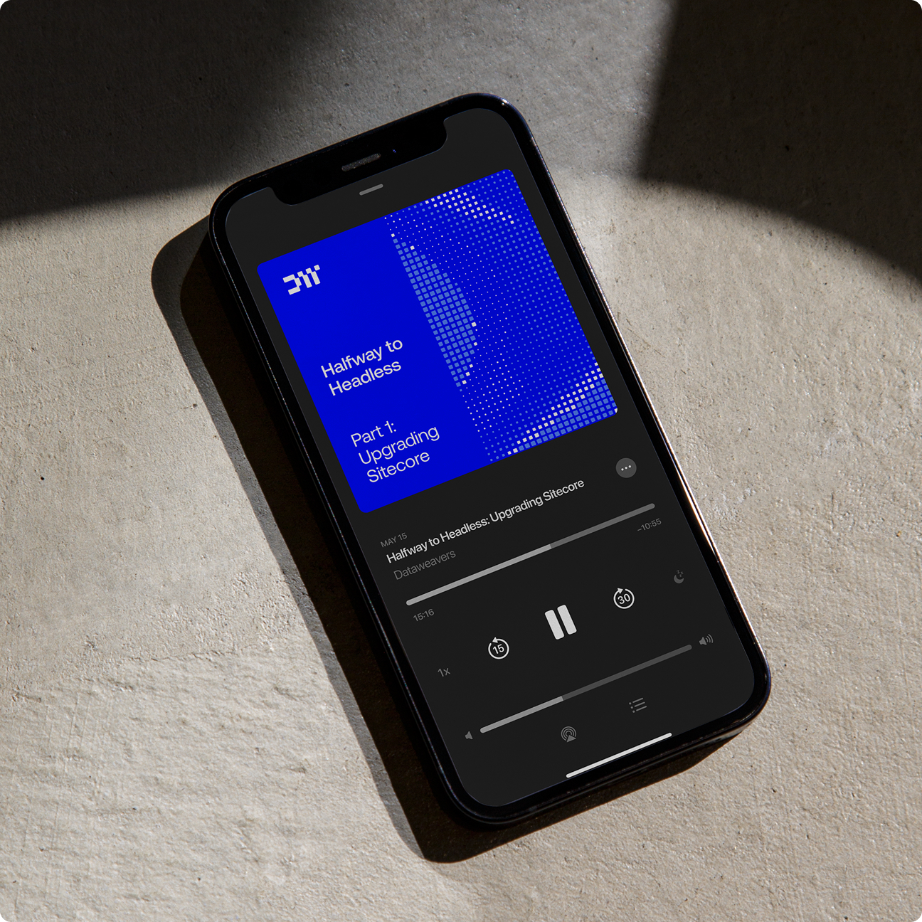
The integration of the nodes ran deeper into the visual identity, informing not only the master DW lettermark but also the sub-brand (product) logos. Revising the colour palette was informed by syntax highlighting, how text editors apply colour when writing code. However, we wanted a clear distinction between audiences. For this, we chose a dark version of the palette for developers and a bright version for c-suite. We continued this rule across the entire website.
We selected 2 typefaces that reflected the personality and complemented the visuals. Iconography was custom created based on the node system, whilst photography instructions were outlined to ensure imagery reinforced the desired brand expression.

.jpeg)
03.
Two inroads, one brand
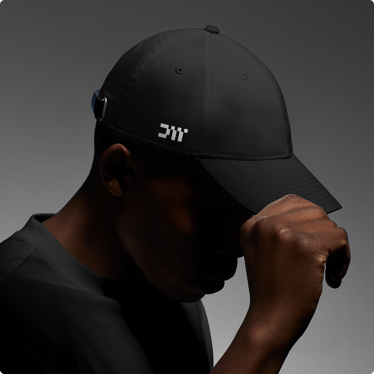
We supported a phased rollout, due to a major symposium in the US happening imminently after the brand was approved. As a result, we quickly provided key assets such as booth graphics and merchandise collateral. From there, we worked closely with the team on the design, content and build of a completely new website. Informed by the brand strategy, this site has 2 versions of all key content, tailored to either a technical mindset (developers) or a business leader (c-suite).