

01.
Setting up for success
We first connected with the Kaiso team at Startmate and knew straight away they were onto something. They had genuine respect for the power of brand and a passion for making a real difference, which made us keen to find out more.

Our first workshop was designed to get deep into their world quickly, understanding the subject, what made it a worthy pursuit, and what the team had already explored. We dived into the mechanics of ISO certification, why it matters and how it's achieved. We pushed the founders hard and asked as much as they could handle.

02.
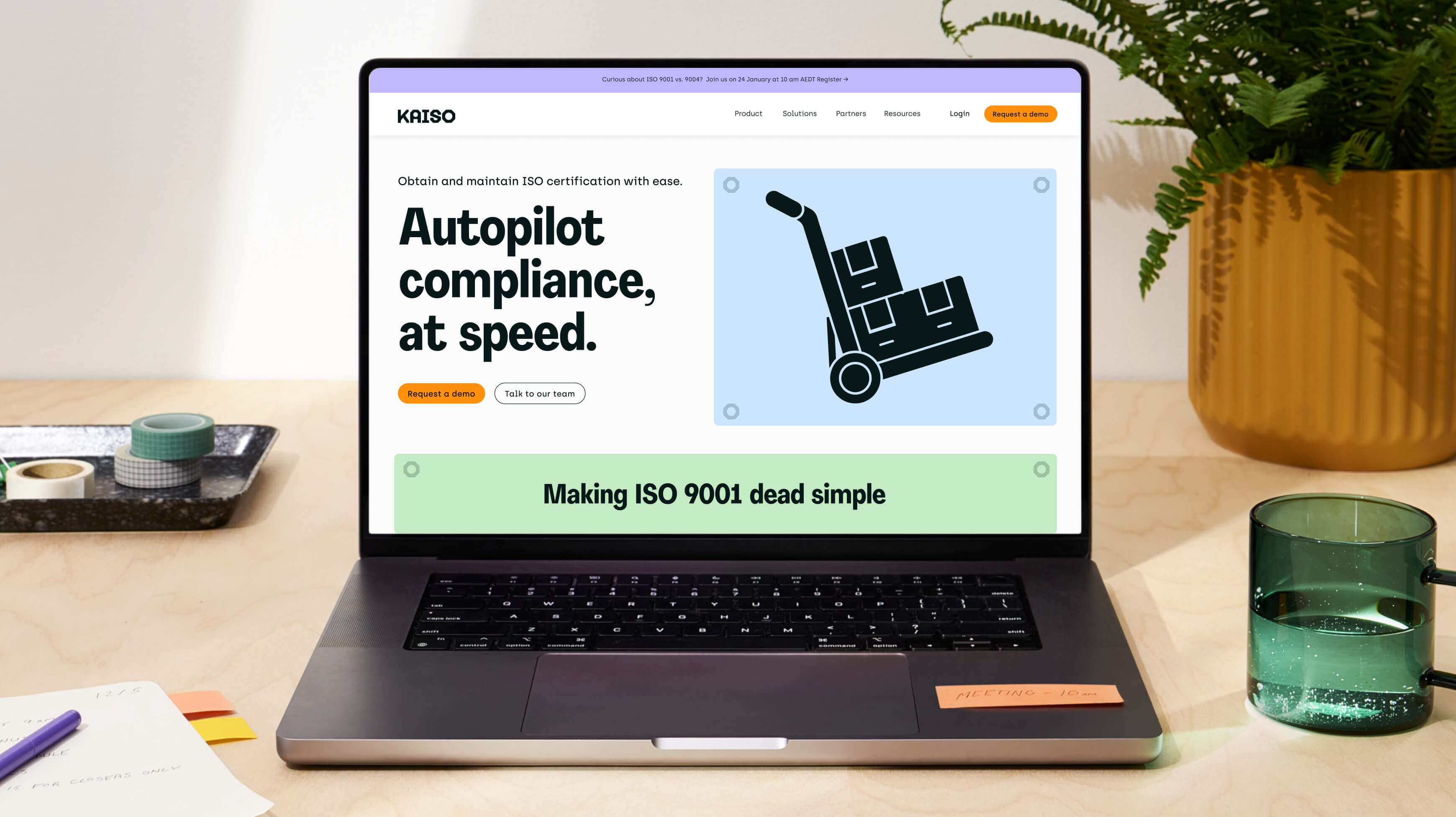
Bringing Kaiso's brand identity to life
The strategic work shaped how Kaiso could stand apart, looking refreshingly digital as a new entrant while staying rooted in the physical world of making things. At the centre of this brand identity was the humble hex nut, a universally simple hardware element synonymous with holding everything together.


Evident in the wordmark, the hex nut could stand alone. So too could Kobi, the mascot at the heart of Kaiso's brand identity. Motion design brought Kobi to life across the product, expressing everything from loading states to error messages and genuine moments of delight, like submitting your latest compliance certificate.


