01.
From Cupcake to Handle
Originally the product was called Cupcake, and whilst we've got nothing against cupcakes (what monster would?), we recommended a name change. We talk about brand naming with founders a lot, because a great name does serious work. It travels without sound, colour or design, and it's the most powerful brand asset a company can own. The right name should spring to mind immediately, and ideally carry some meaning on its own.
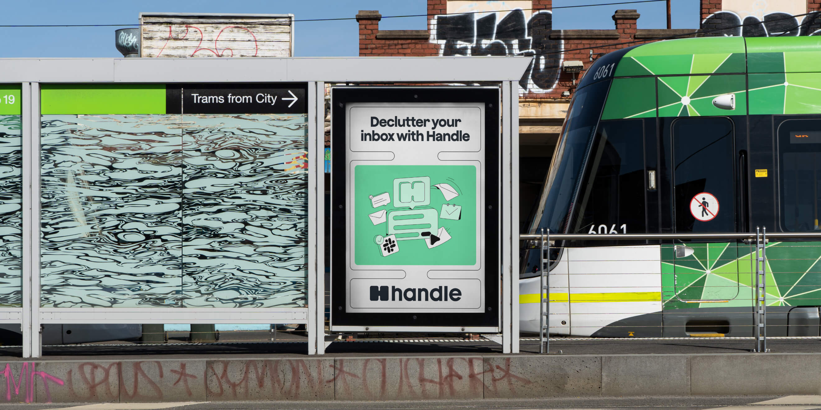

Working together, we landed on Handle. A real word, easy to say, and loaded with meaning. If a prospect could quickly infer that this technology would 'handle' something for them, we were already halfway to convincing them.
02.
Building a brand identity that puts humans first
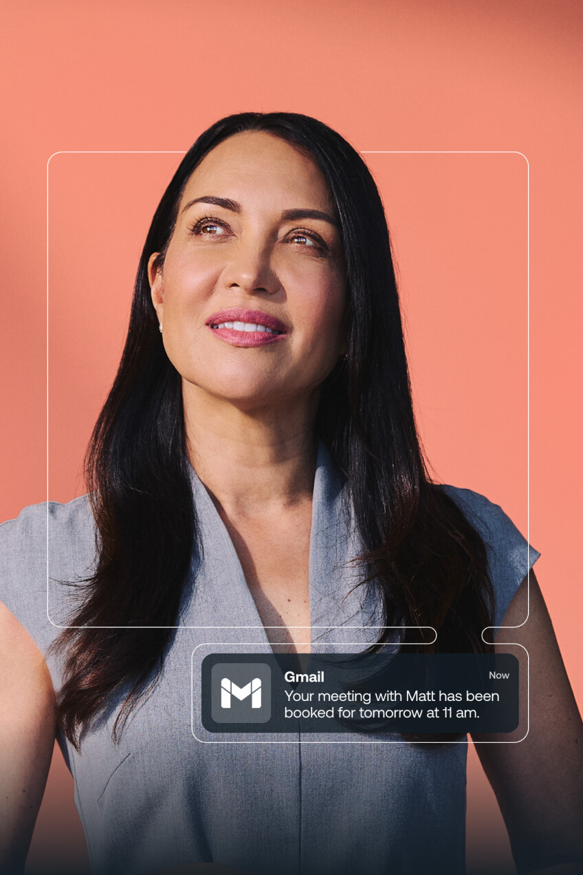
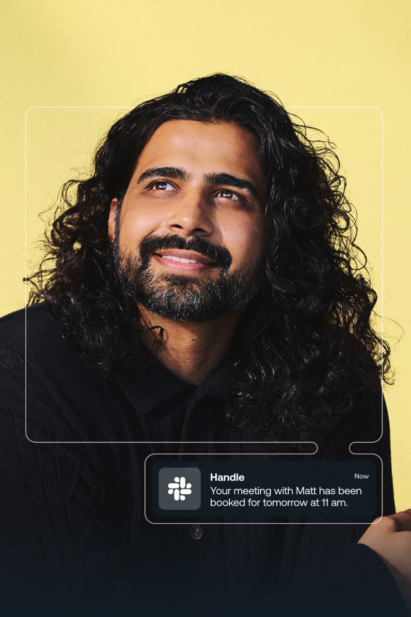
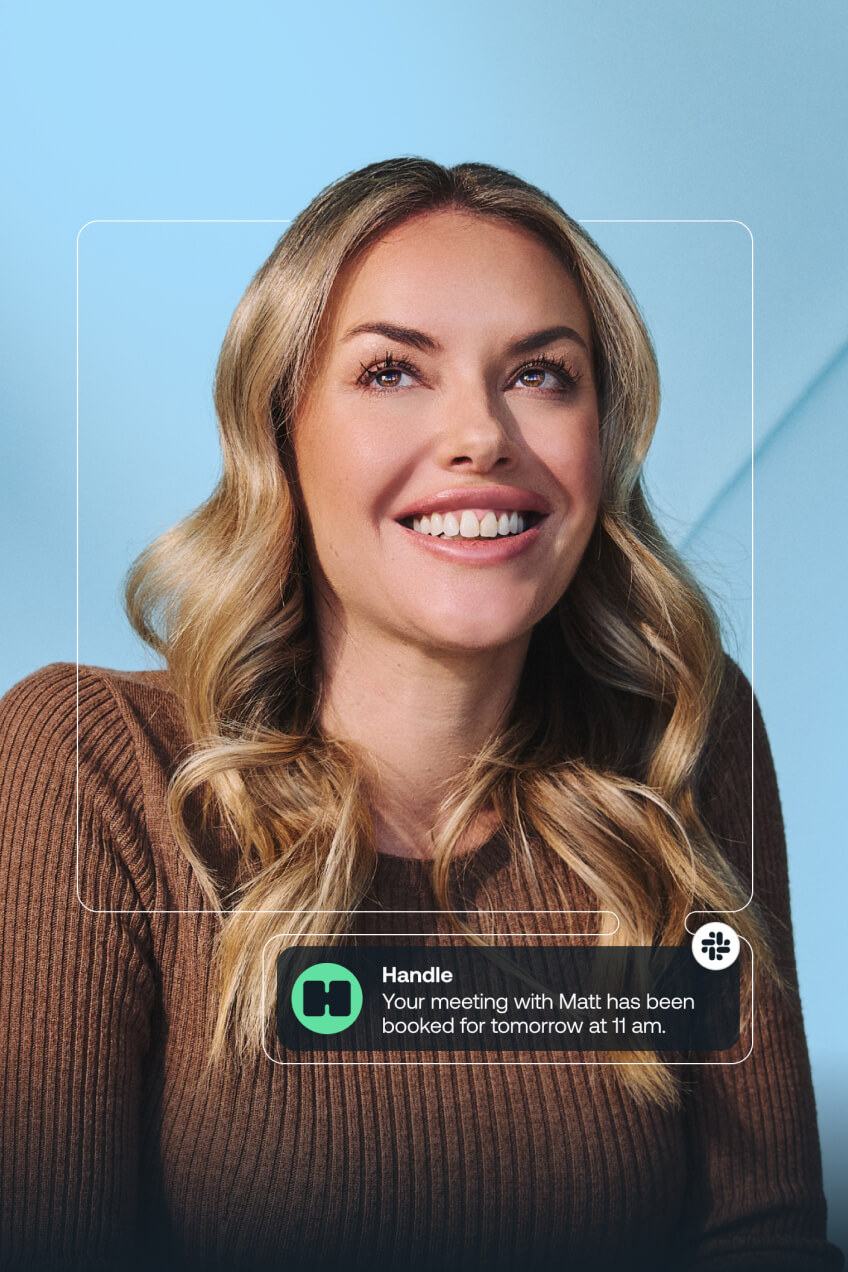
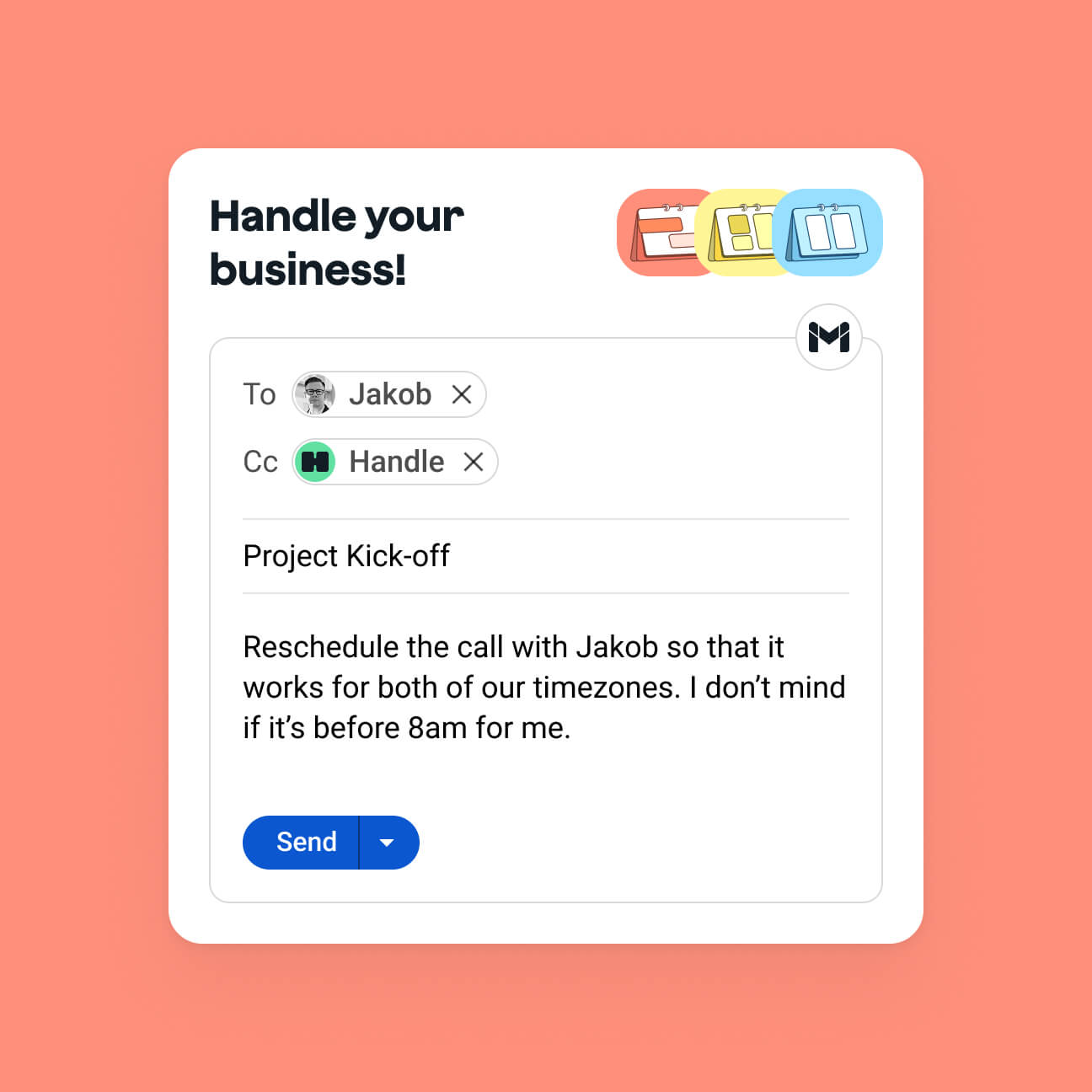
The Handle team had a clear view from the start: AI exists to serve humanity. Organising meetings — repetitive, tedious, time-consuming — is the perfect use case. It frees people up to do what they're actually good at: connecting with each other. That became the central idea the brand identity needed to express.
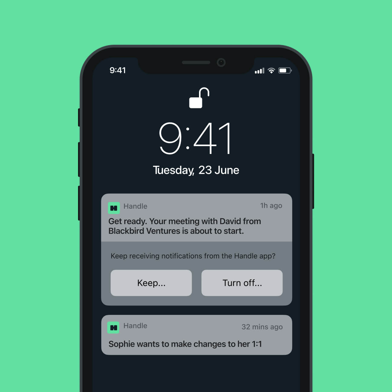
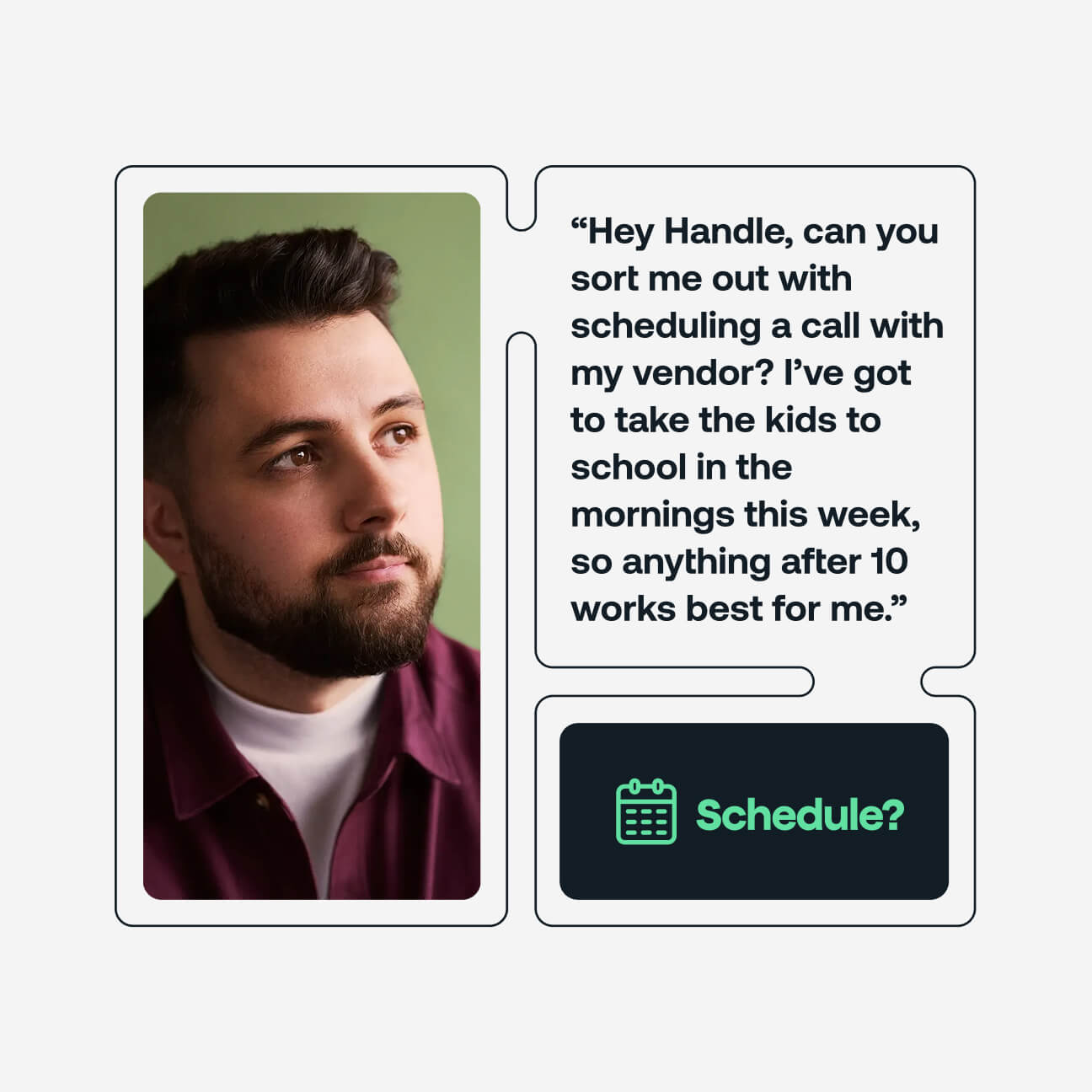
From the 'H' logomark through to the graphic system, connection was built into every element. We chose real-life photography over AI-generated imagery: no stock, no shortcuts. The colour palette landed bright, optimistic and fresh. Every decision reinforced Handle's perspective that the best technology doesn't replace human experience, it makes room for more of it.
03.
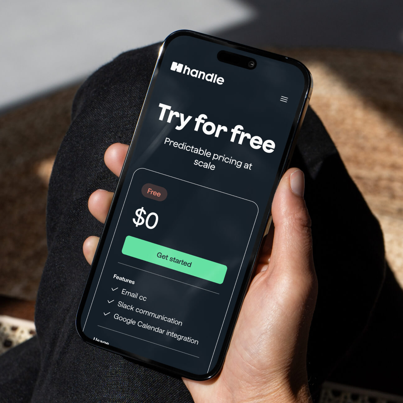
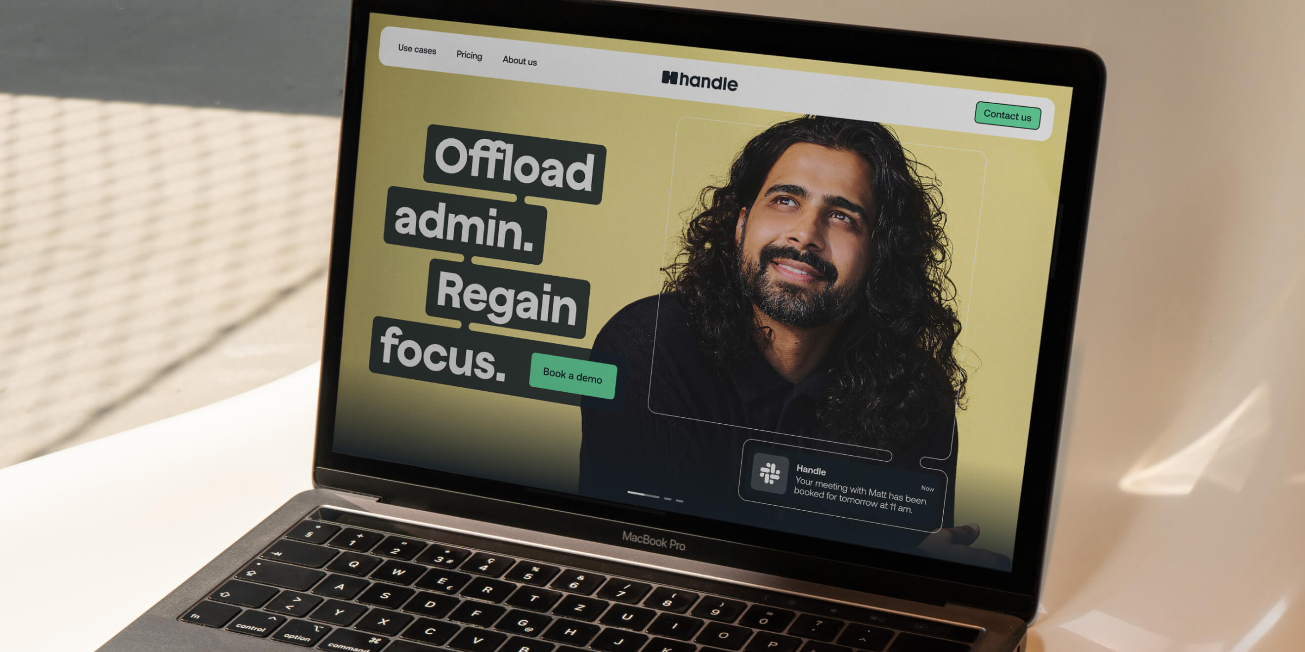
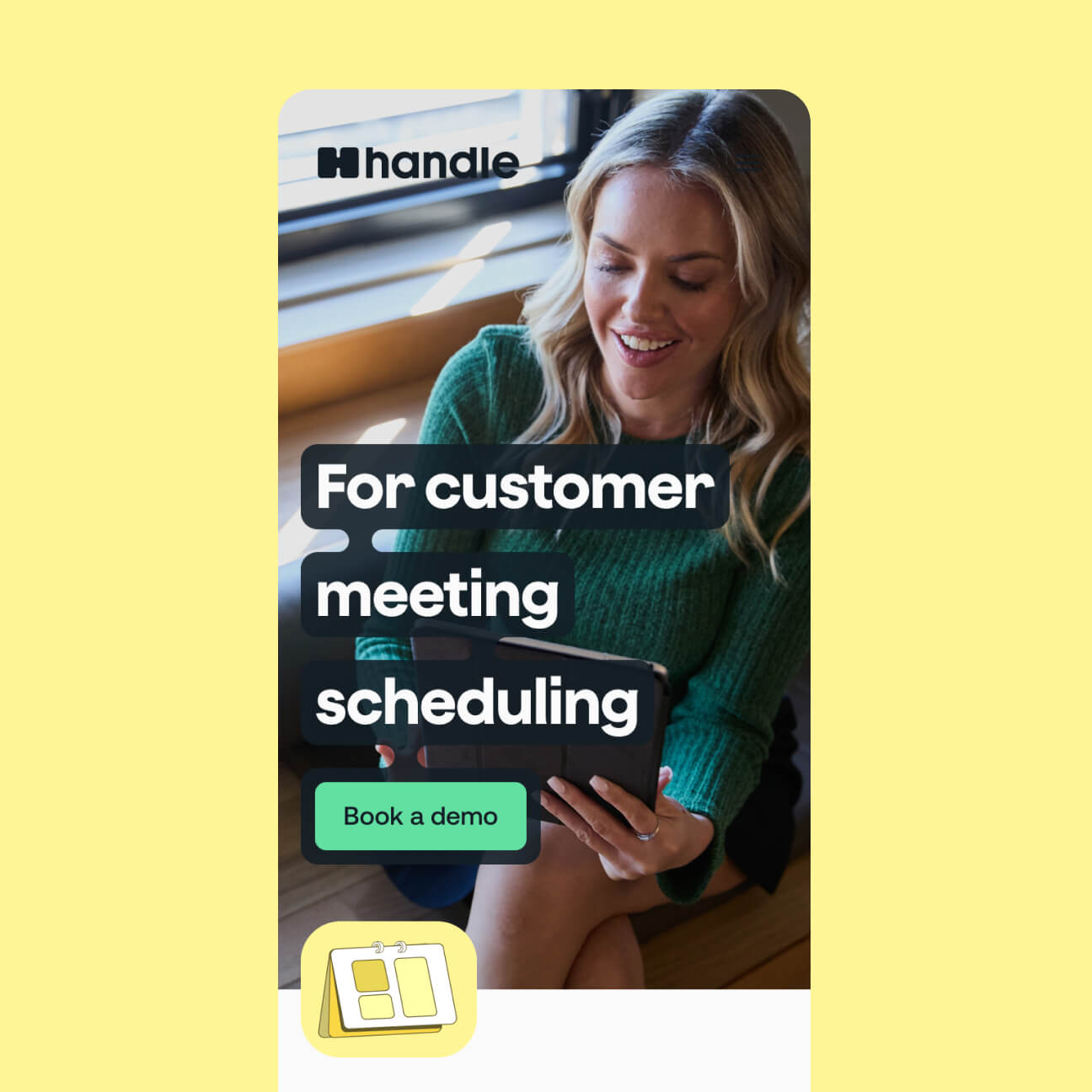
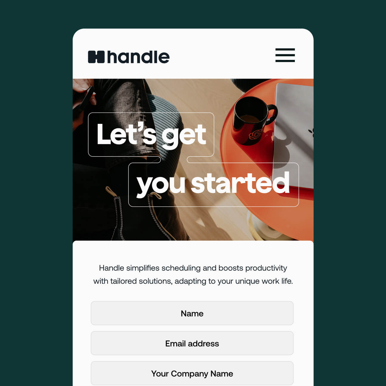
Launching Handle
With naming, brand identity development, and photography complete, we designed and built a website that could demonstrate Handle's product across real-world scenarios. Real photos, real people and real use cases grounded the proposition in something authentic.
Today Handle is growing locally and internationally, expanding its capabilities every month. We check in regularly with Nathan, Jack and the team, and we're genuinely looking forward to the next stage of their brand story.