01.
Interrogating the brand potential
We kicked off with our investigations, researching competitors and the founder space, as well as running workshops with the team. We then distilled the findings and worked with the team to refine further. When it comes to the category of software development, we specifically looked at how different brands around the world were positioned and how we could stand apart.

With our initial team comprising of Argentinian developers and the fact we have a competitive edge in running a centre of excellence in the space, we quickly identified unique positioning that would help drive compelling reasons to engage clients not just in Australia, but in the US and Europe as well. It became clear that the name was an opportunity to further expand the communication potential of the brand.
02.
More than a big name
The original company name was Scalemote. Derived from the desire for clients to ‘scale’ business and coupled with ‘mote’ as a fragment of ‘remote’. This portmanteau was limiting the brand. Our positioning work identified an opportunity to be brilliantly bold, unashamedly obvious and distinctly memorable. It wasn’t about being big, it was about providing the potential that any client, at any size, could go bigger.
03.
An identity bursting at the seams
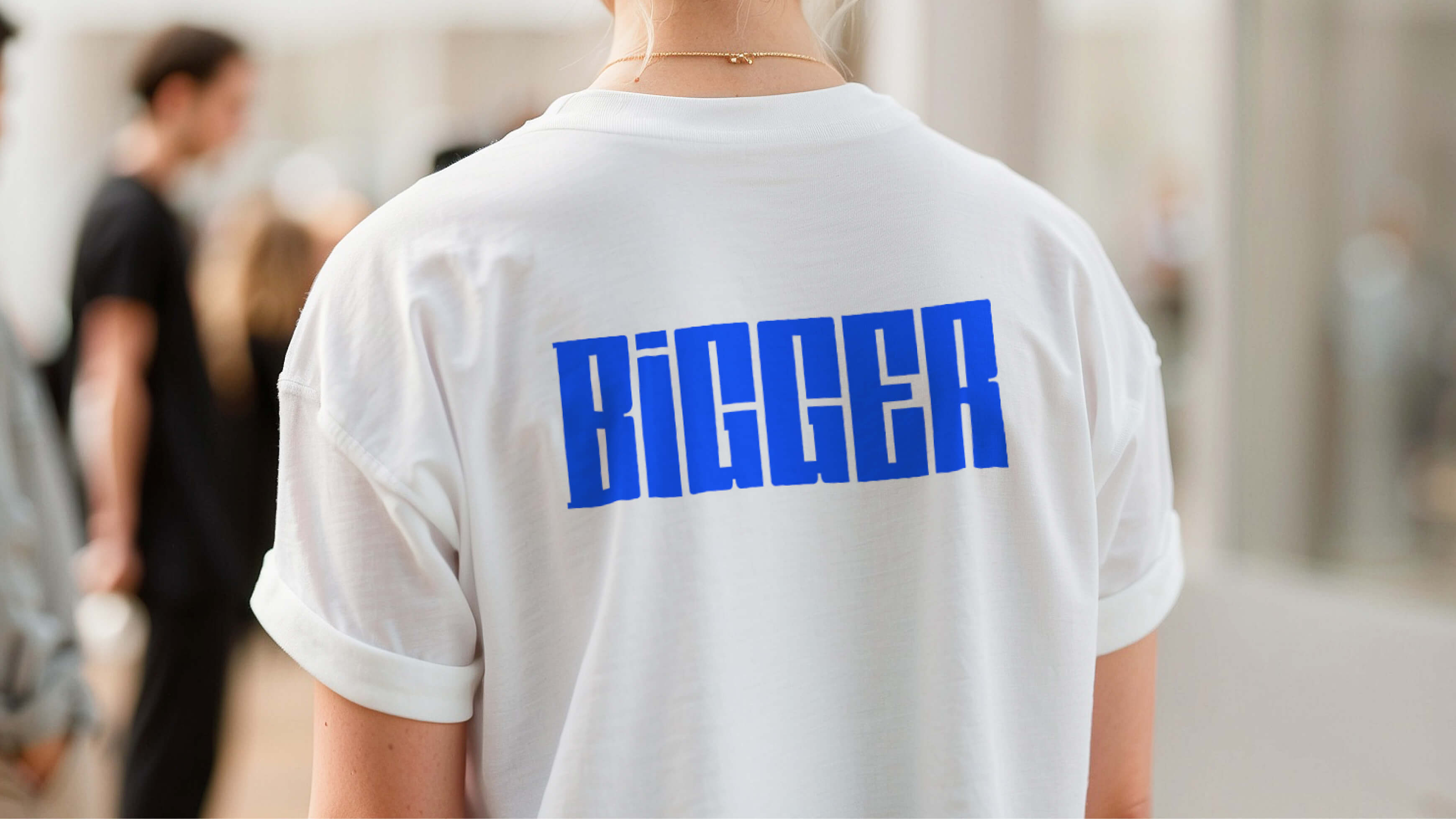
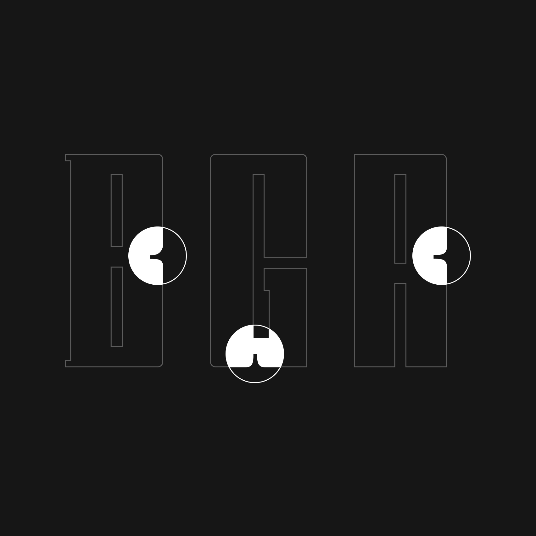
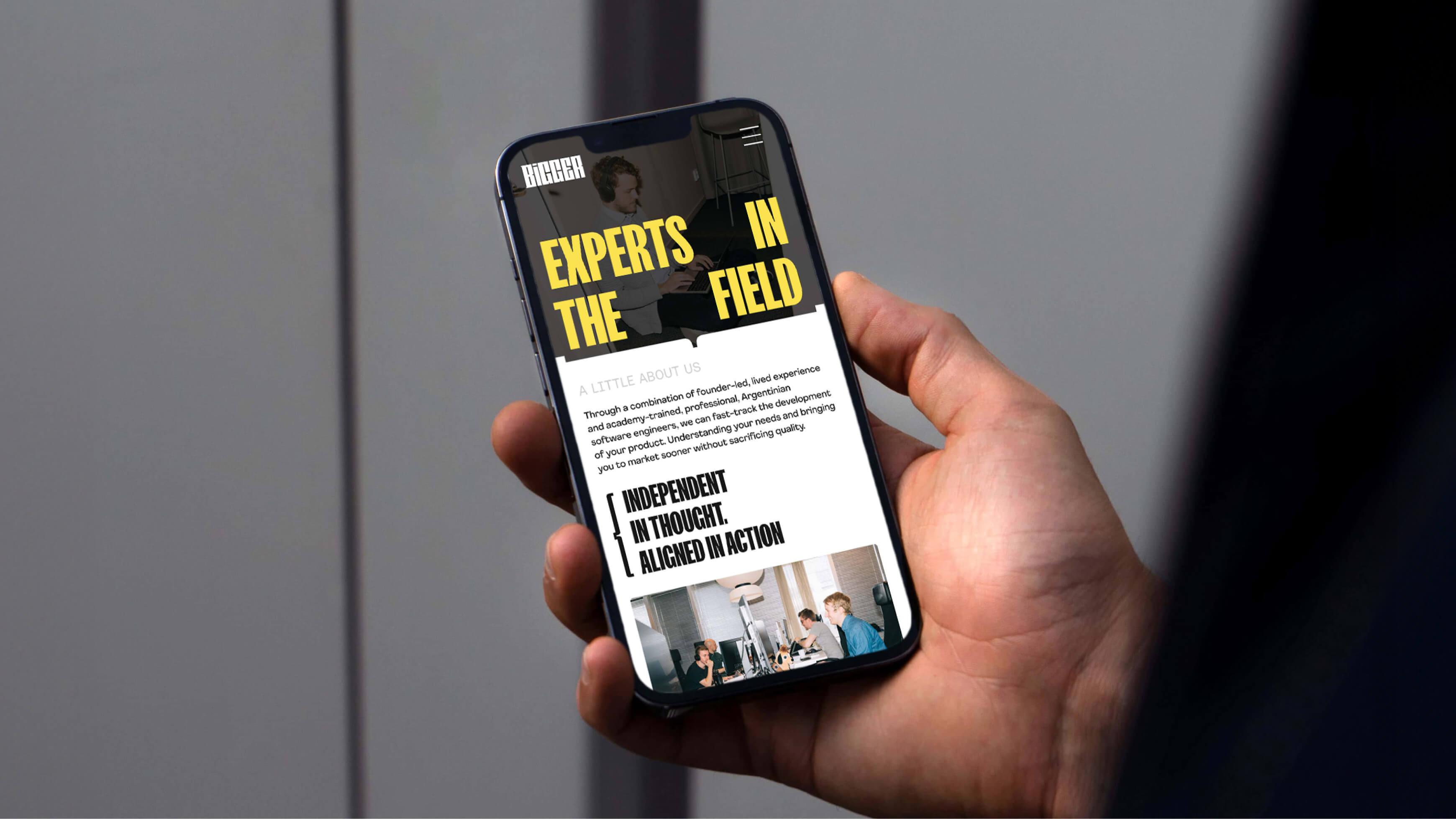
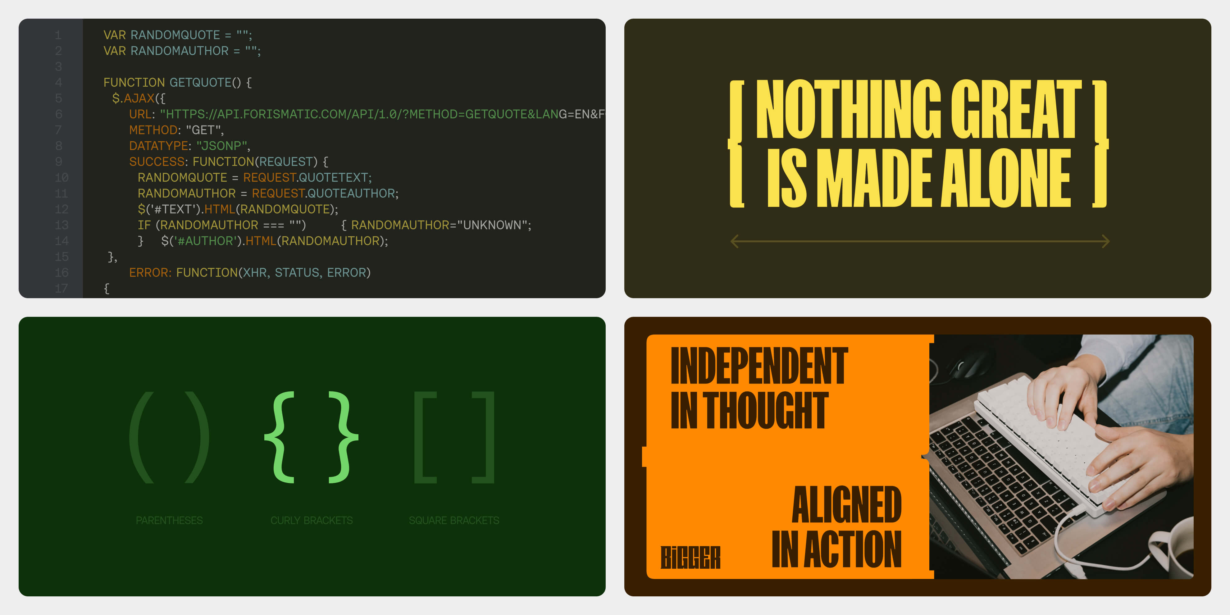
A cheerful and energetic name needed a visual identity to suit. Taking inspirational cues from the world of code languages, we explored brackets as graphic devices. Starting with quintessential curly brackets, we reduced the curves but left the signature shape. Adding harder edges and bulking them out to represent the hefty feel of the brand. This developed into a versatile device for containing text, holding colours or even framing photography.
The bracket then informed a chunky, bold wordmark, capturing the unbridled spirit of the brand in a way completely unique to the competitive set. Filling an invisible boundary, the mark is barely contained, just like a founder’s potential.
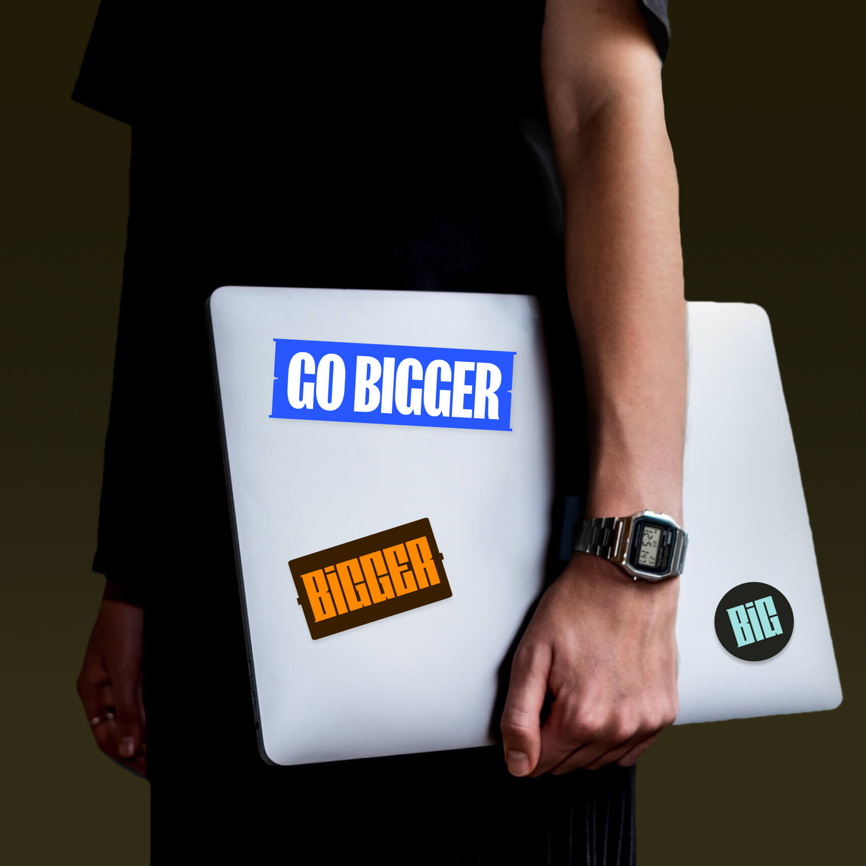
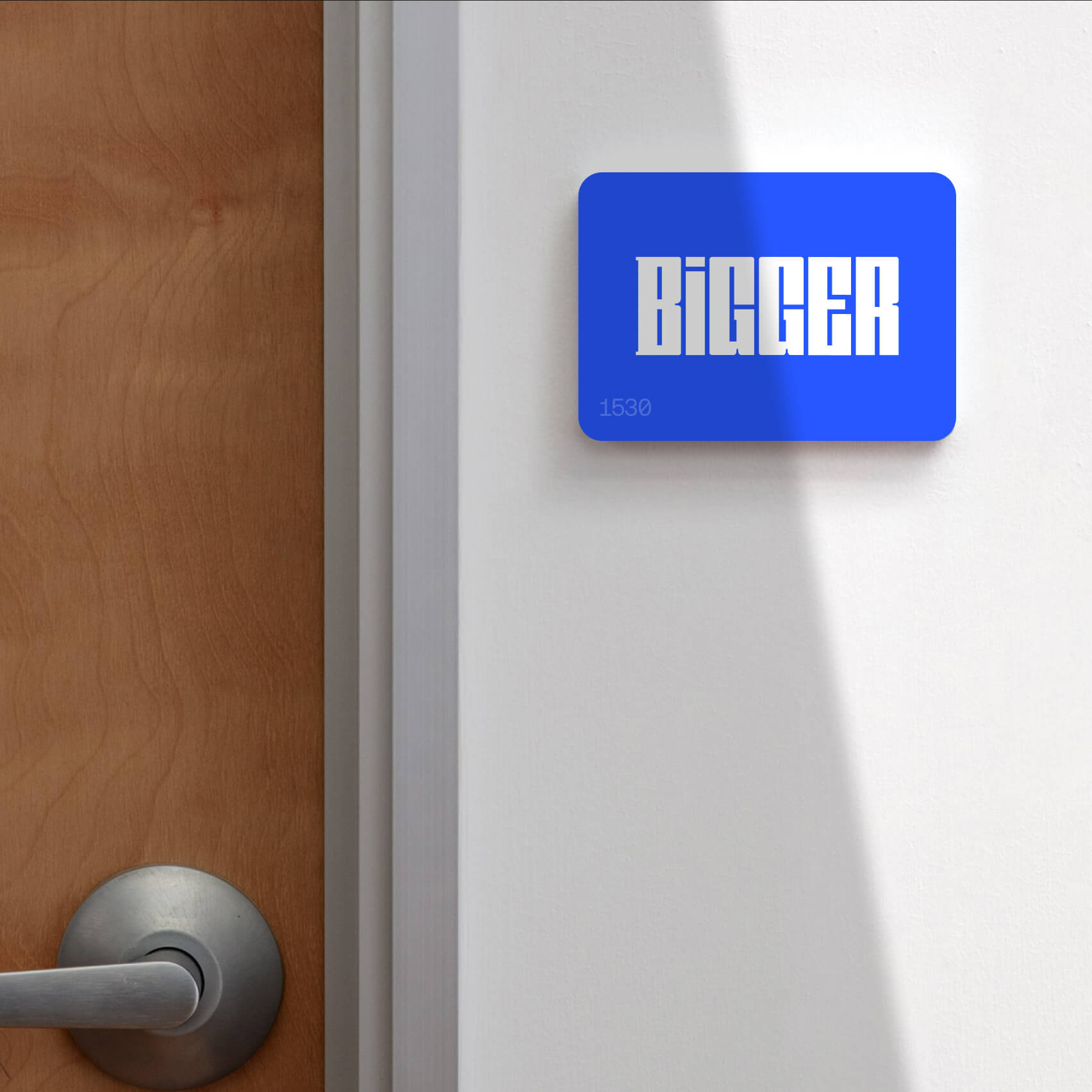
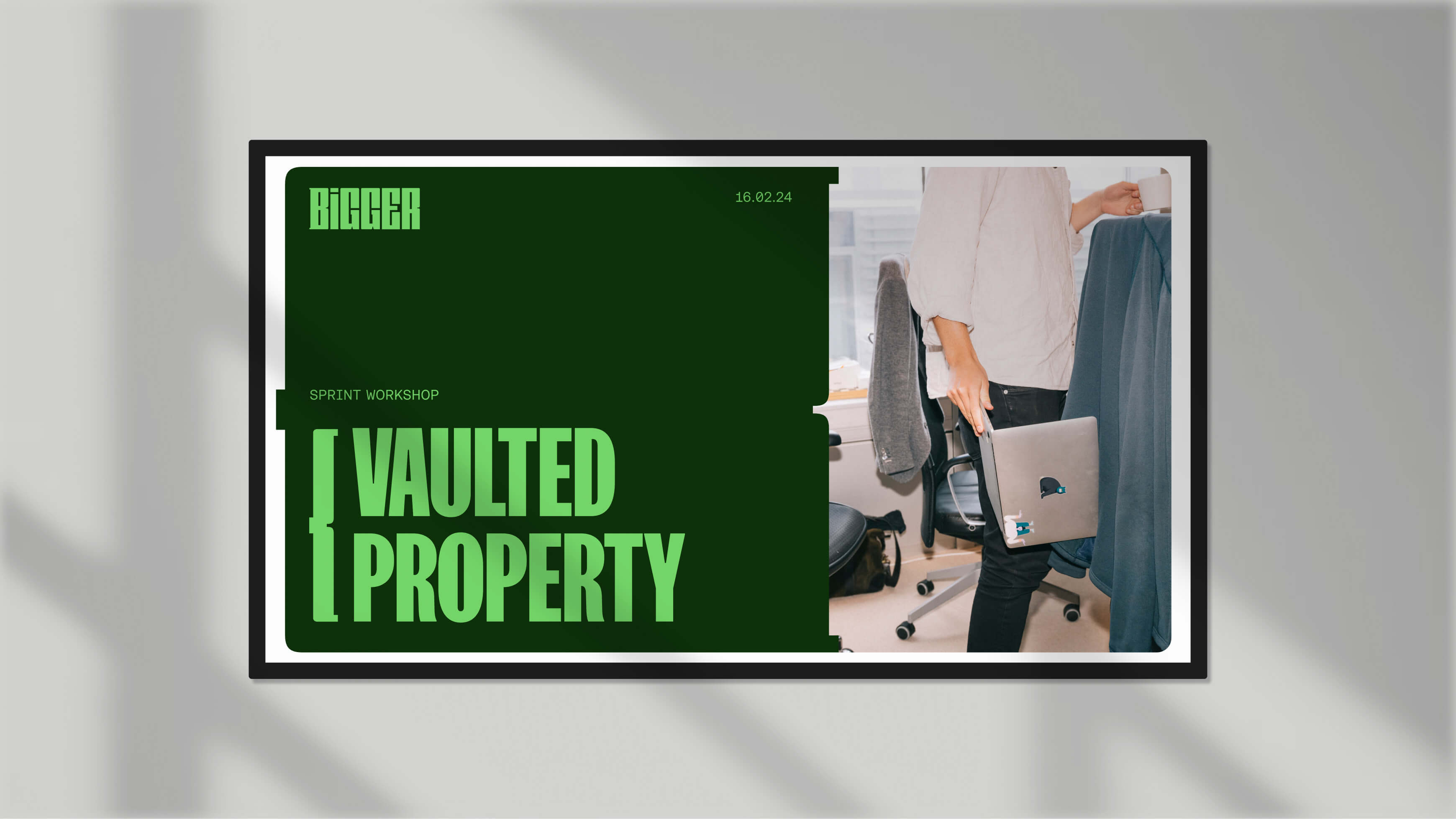
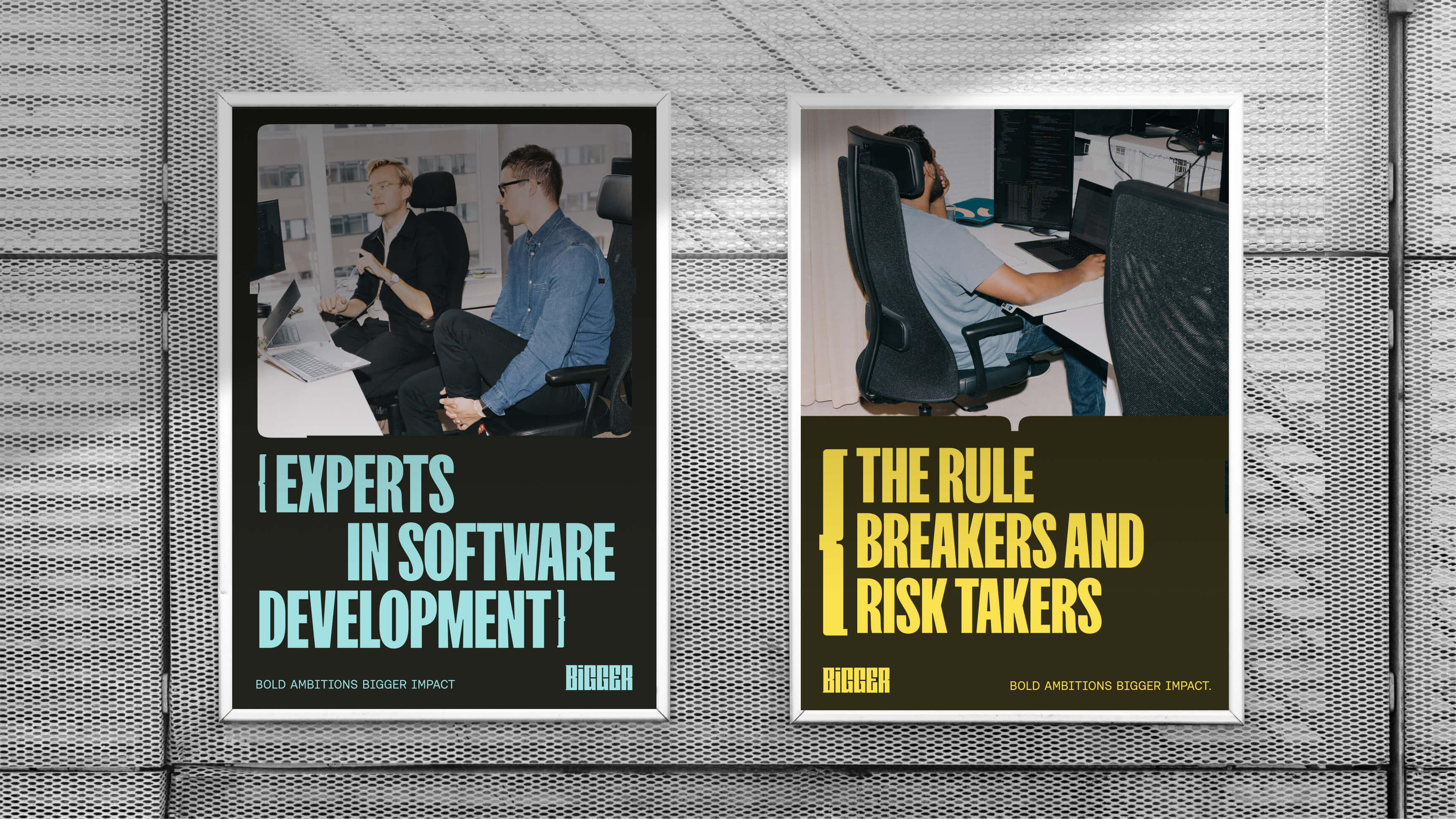
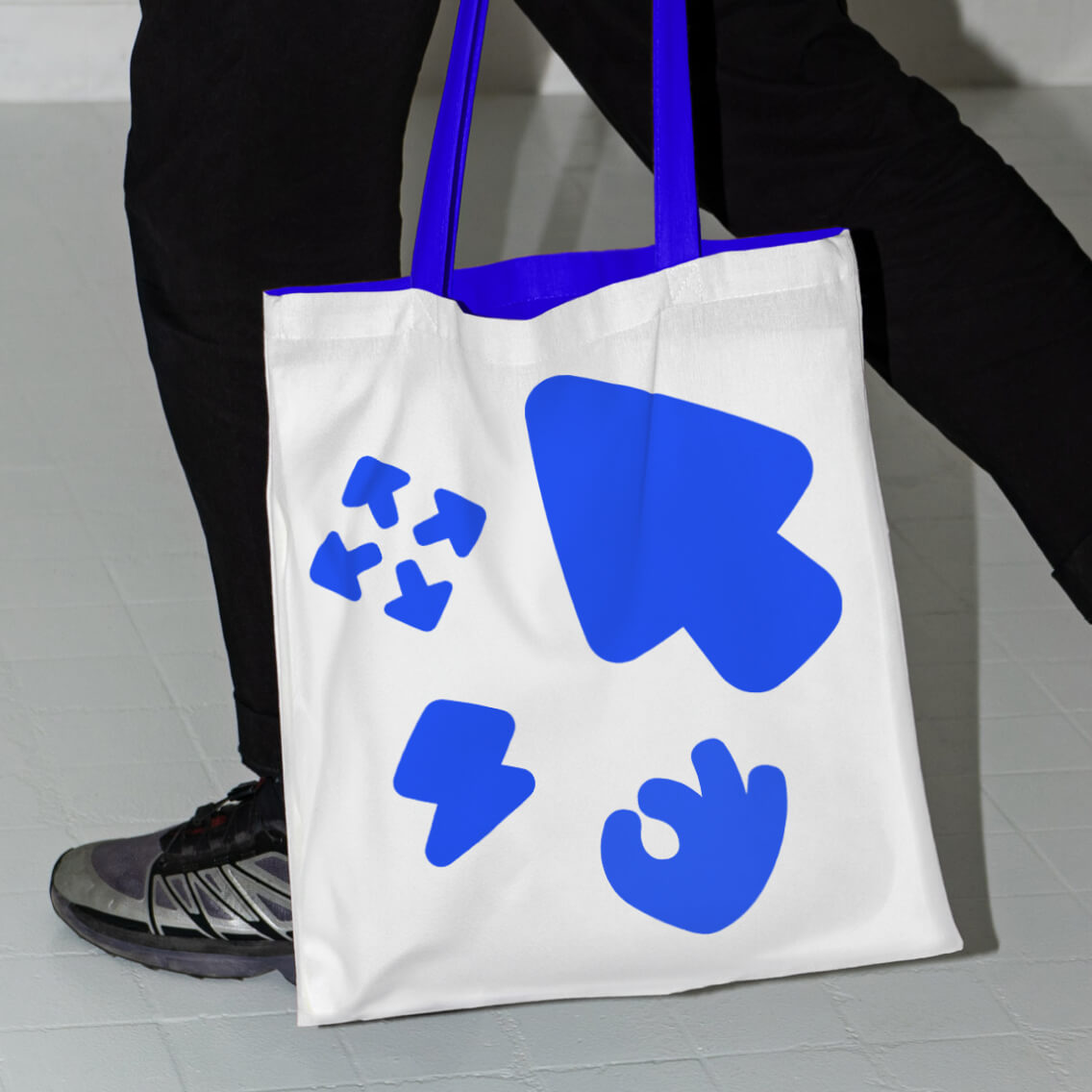
Finally, a colour palette born from the high-contrast code language seemed fitting, both due to its link to the world of development as well as the confident blend of dark and light. Coupled with copy in all caps and a custom icon set, Bigger couldn’t be any, well... bigger.