01.
Workshops
A big part of many processes at UntilNow involves structured workshops. The team from TSP were actively involved from the beginning, with remote figjams helping to distill key communication imperatives. We unpacked the unique personality of the brand and found that it had to strike a balance between a comforting sense of familiarity and a refined experience. From this a clear brief was developed to specify exactly what the brand needed to communicate visually.


It was clear from these early workshops that the calibre of guest was a key strength and that we should showcase them cohesively within branded assets.
02.
Design directions
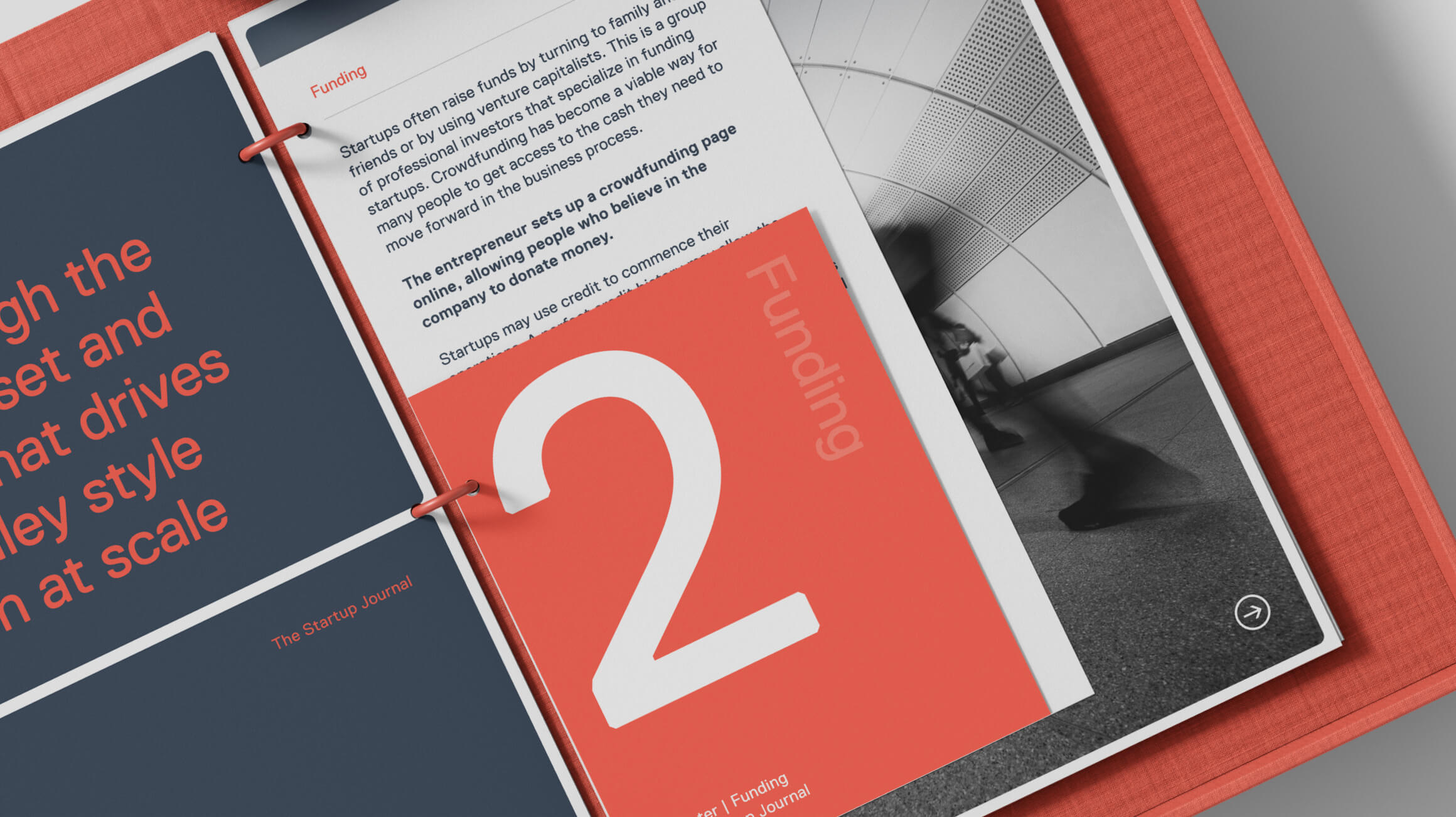
We discussed multiple directions the visual identity could go, including some that were anchored in metaphors, some that were less abstract and a whole lot in between. The selected preference was a bold, geometric approach. Reflecting both Gantt and stock market charts as well as sound bars, this direction set a confident and established tone. The 3 bars were defined by the three words in the brand name. Simple in design yet unique in context, this allowed the logo to work with and without the text inside. The legacy of the orange colour was maintained but amplified with a touch of red and contrasted against a blue charcoal for balance. A carefully selected typeface called Replica completed the gridded balance.

The final result result has been described as worldly and authoritative; the BBC meets the CIA. We like that.

03.
Visual identity delivery
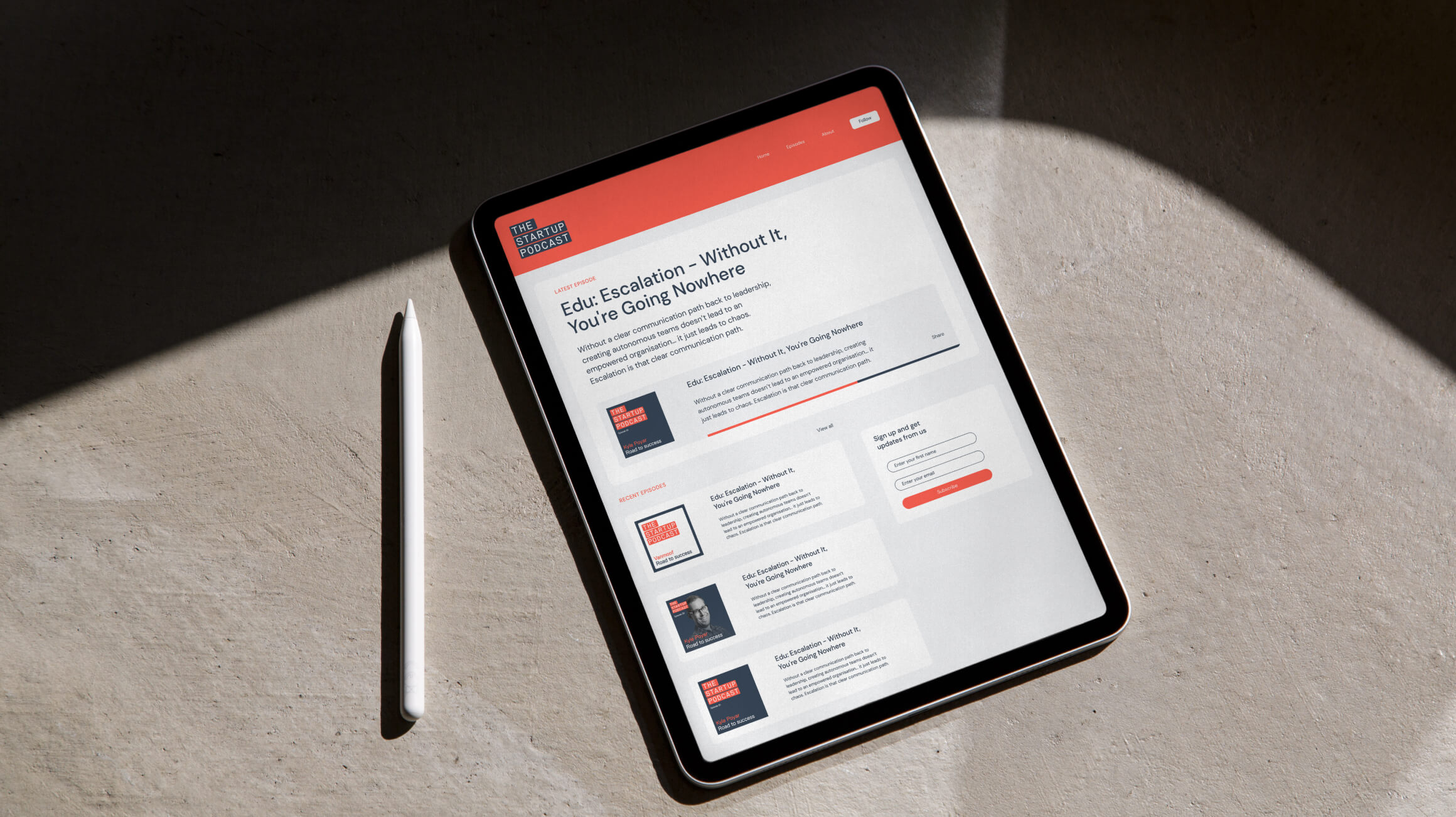
The final identity was packaged up and delivered in all key assets along with guidelines. Additional work went into the development of audiogram and episode cover templates in Figma. These designs help support the ongoing production of consistently designed graphic assets. It was a pleasure to work with Chris and Yaniv on their podcast identity. You can see the brand in full at on their website and if you tune in to the podcast you might even hear a familiar voice or two from UntilNow.