01.
Interviews
Our client knew that concrete suppliers were reluctant to supply small orders. To understand how this affected stakeholders, we conducted extensive interviews with tradespeople who ordered concrete daily through to national suppliers. We discovered that residential builders get bumped, and they know it. As a result, they’re left having to call around, scrambling for concrete, often having to over-order to de-risk being overlooked.

Our client wanted to cater to both sides of the marketplace, to help shift the future direction of the industry. More than this, they wanted to nurture the relationship between buyer and supplier via a platform designed to support an exchange that’s fair, empowering, and mutually beneficial.
02.
Brand audit and naming
We conducted a brand audit, chipping away at visual elements and language that weren’t adding to our client’s vision in a meaningful way. We took to Bunnings to review the grammar and visual world of tools and supplies.
Through multiple workshops, we renamed the product from Pour to Found, favouring its clarity without literal connection as well as its double entendre: Finally, tradespeople can find the concrete they’ve been looking for and get on with laying solid foundations.


03.
Branding
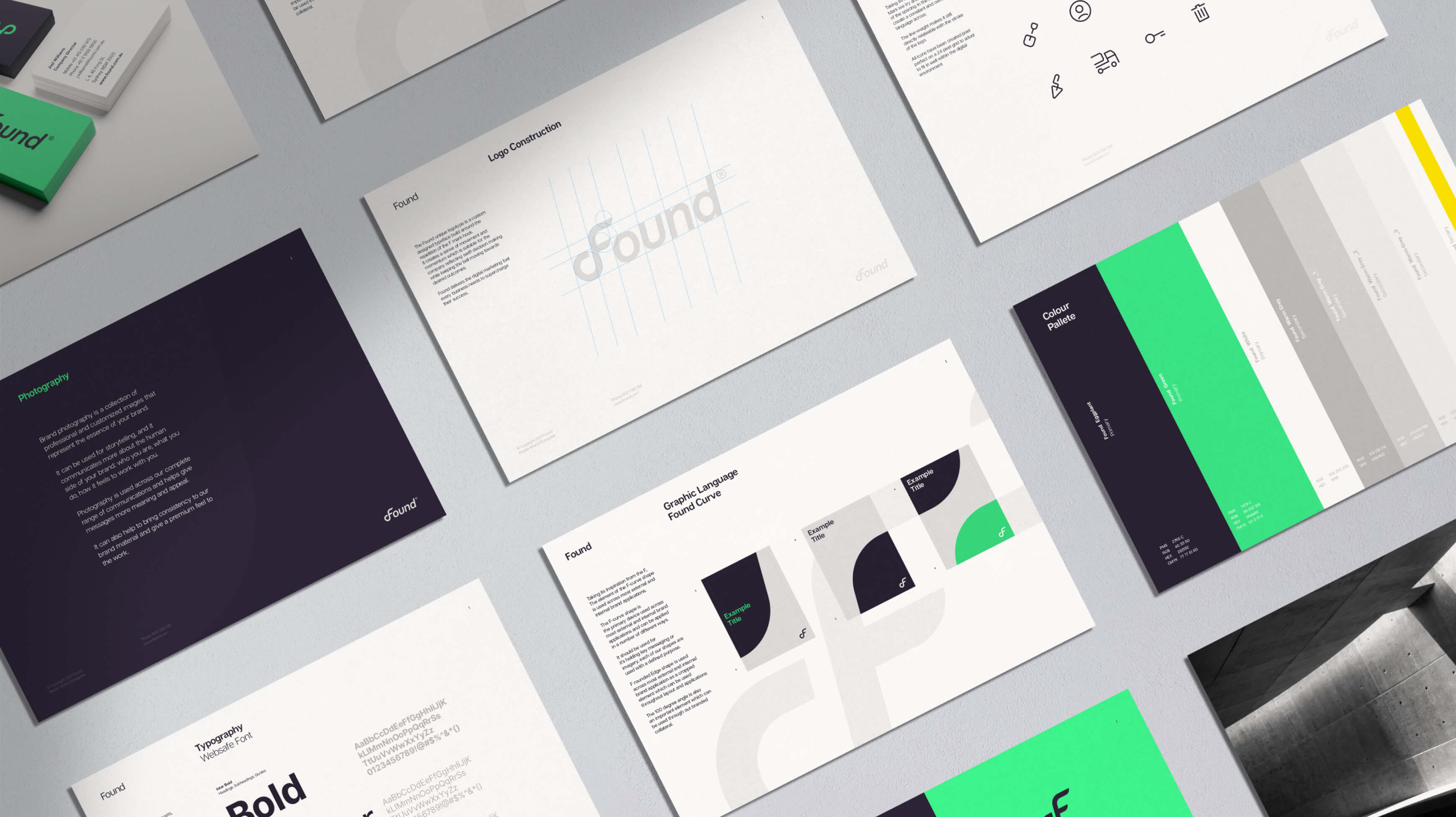
Found’s users take great pride in their work. They build environments that can last generations. Our client wanted their brand values to reflect those of their users. Through collaborative workshops, we arrived at values that felt right, like simple, crafted, and powerful.
.jpeg)
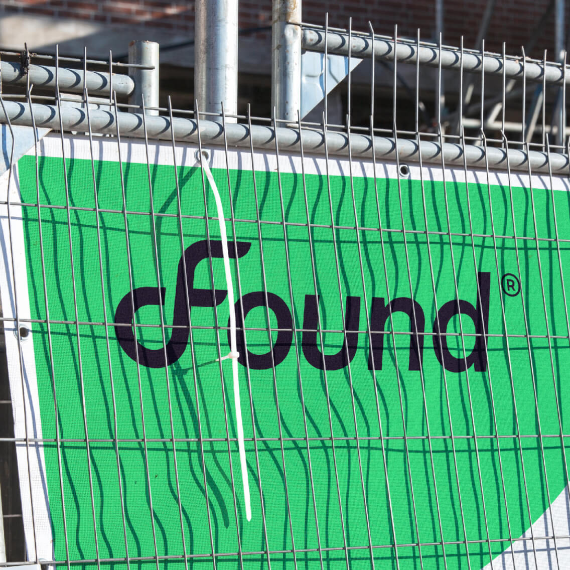
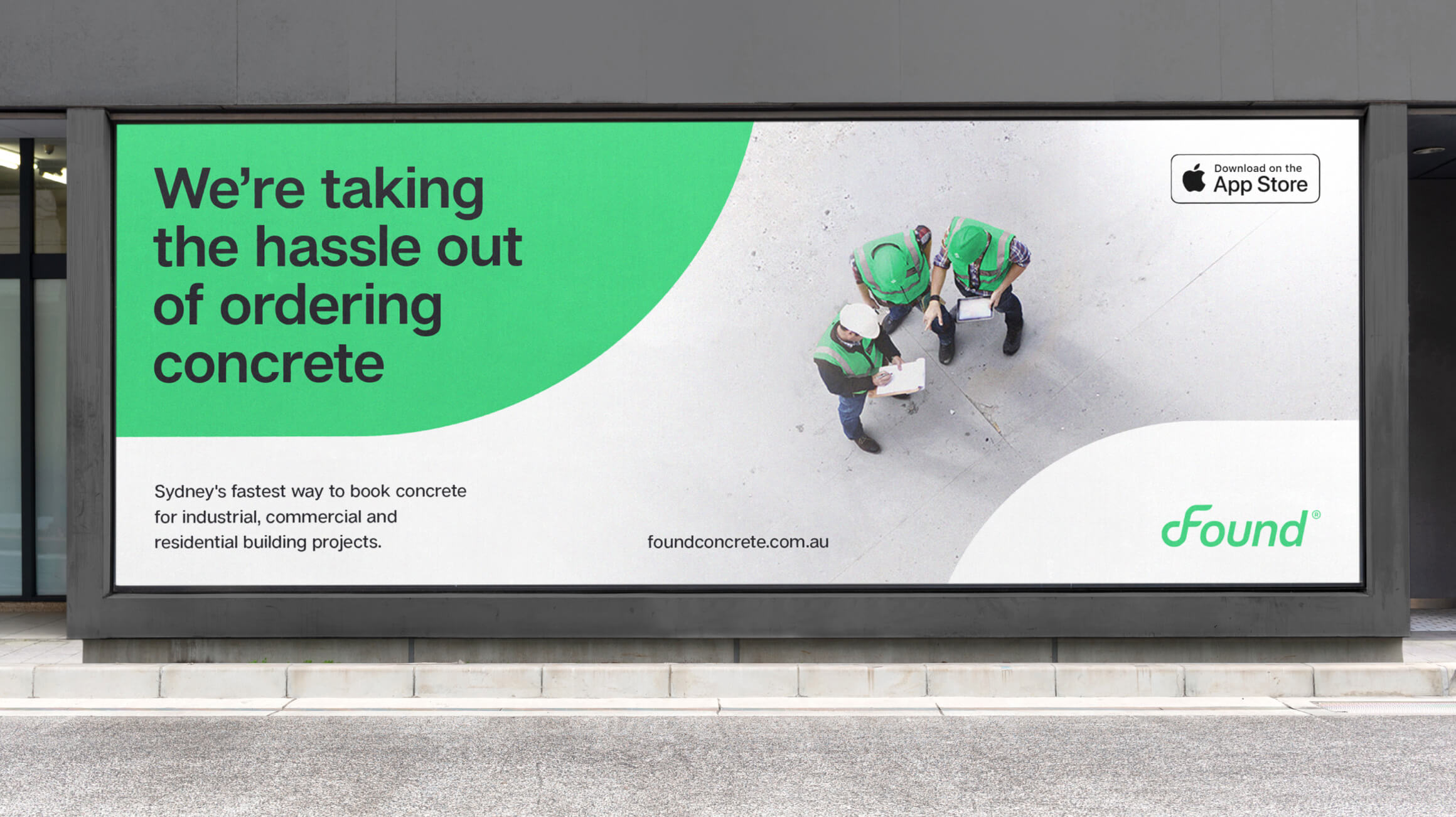
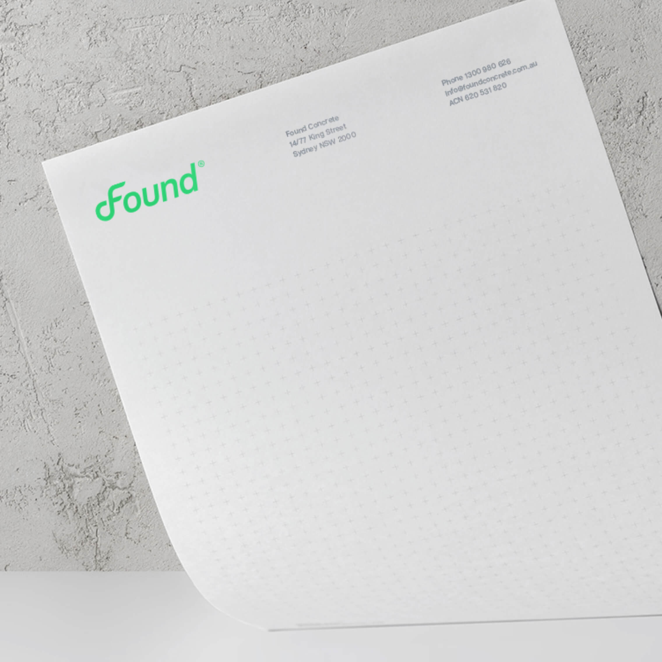
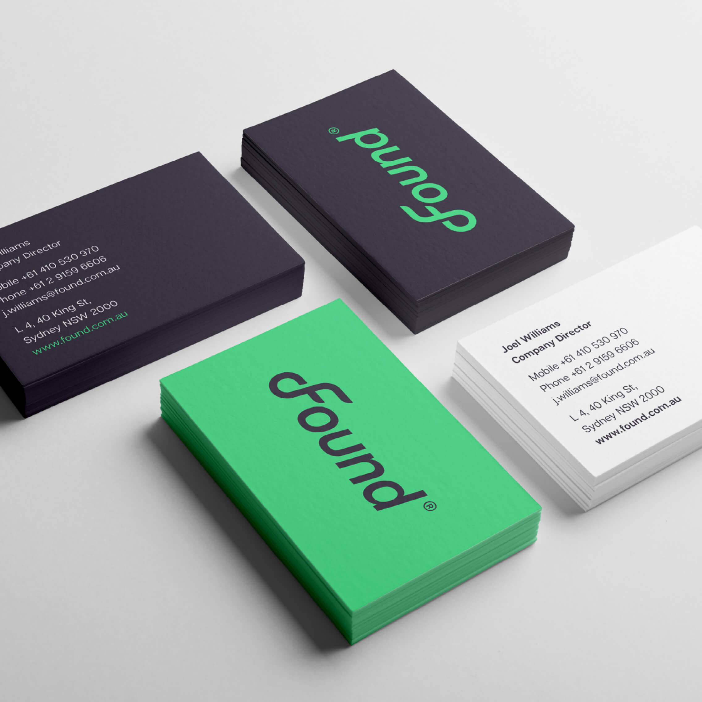
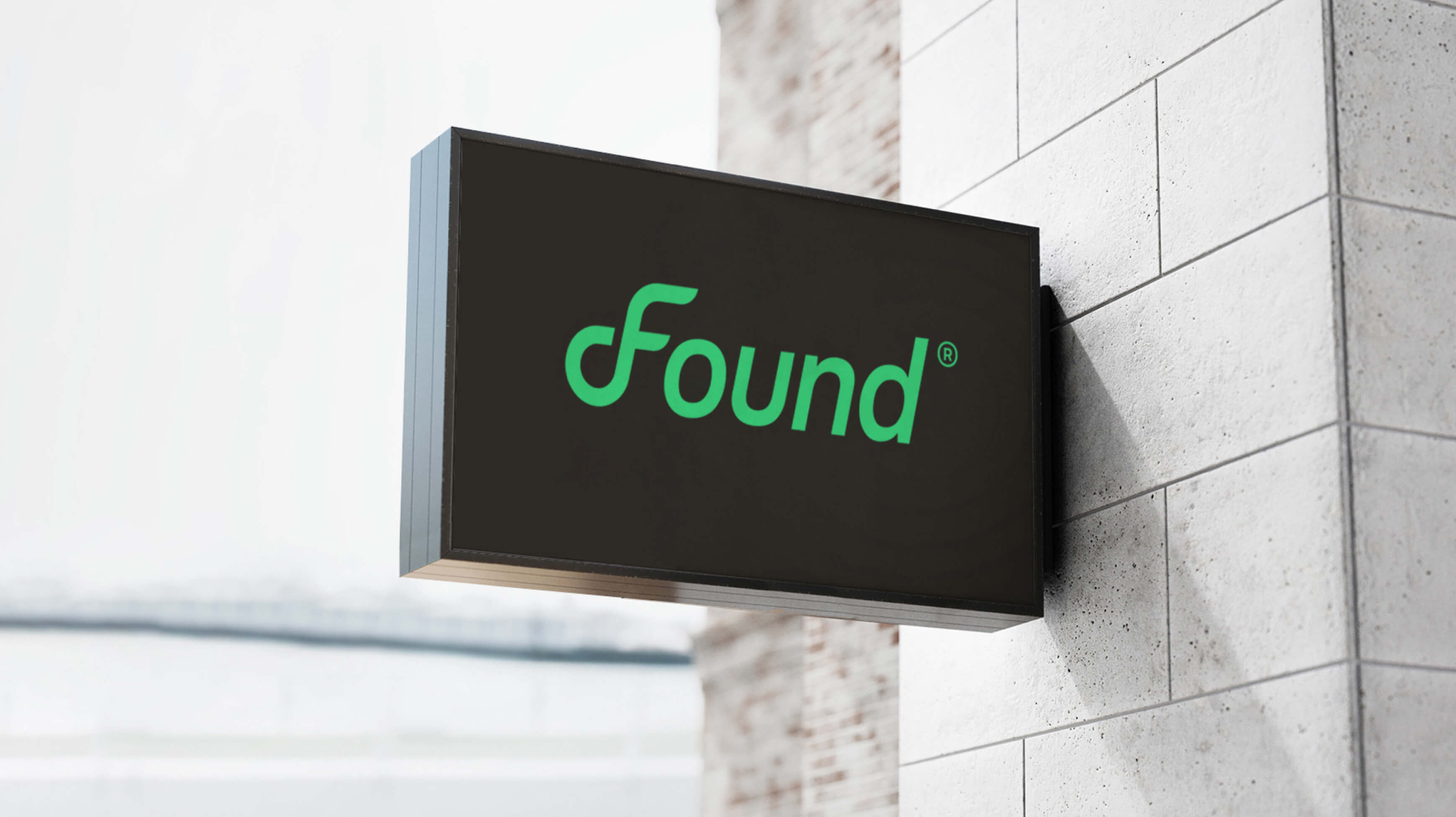
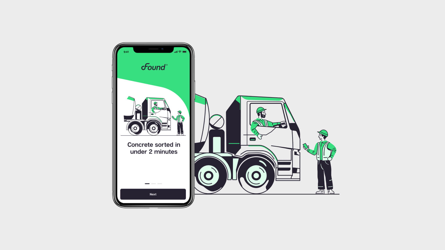
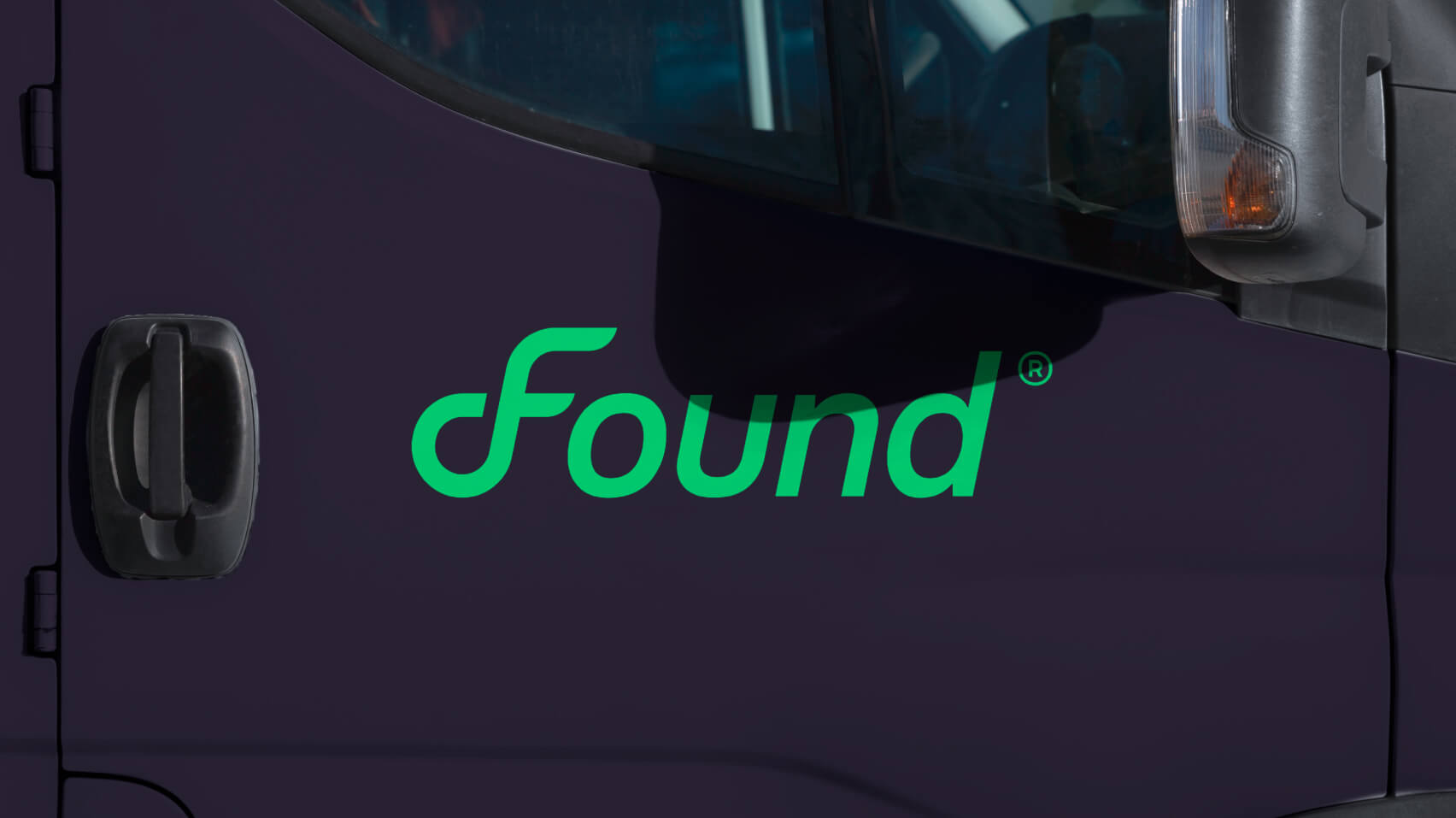
Found is an innovative, tech-enabled product, so the visual identity had to look fresh, modern, and vibrant. We chose an energising electric green and friendly illustrations of tradespeople portrayed in realistic proportions, which we offset with down-to-earth, monochromatic photography of real workers. Our intention was to blend tech and human elements - after all, our client was introducing an app to an industry traditionally built on phone calls and onsite banter. The customised wordmark leans forward, as if striding ahead and is executed in a monoline, meaning it’s all the same width much like a road. The logistics reference is reinforced with the ‘F’, looping around like a highway overpass. The graphic language of these curves signal a sense of momentum and flow - as smooth as concrete.