01.
Customer research
Our client came to us with a clear objective: to offer Aussies a better way of buying beer, wine and spirits online that felt enjoyable, easy, and educational. A place to go to discover a new ale, or learn something about how it was brewed, as well as purchase drinks and have them delivered to your doorstep. In 2018, this was one of the very few online alcohol delivery services in Australia. Our client was up against big market players, like Dan Murphy’s and BWS. However, they wanted to do things differently, like feature niche, less commercially known brands while still offering a huge range, and create a tailored and personable online look and feel that people wanted to come back to time and time again.

We were determined to get inside the minds of our client’s target audience, so we conducted 15 interviews with existing customers, and sent out a comprehensive survey to the younger target audience they were after. We learnt that these consumers enjoyed a good sesh as much as they appreciated recommendations from a trusted source, like that one hipster friend who’s incredibly passionate about hops. For their perspective, the tone of our client’s competitors felt serious, contrived, top-down, and a tad tedious. Plus, they weren’t mad about the focus on quantity over quality. It simply wasn’t engaging the average craft beer (and wine and whiskey) enthusiast. For these drinkers, buying online was an opportunity to try something different. But they had to have fun along the way. What they wanted was an online experience that was light, amusing, and relatable. Like, did you know, the fermentation flavour of a particularly yeasty beer can be described as ‘horse-blankety’? Neither did we.
02.
Naming & Rebranding
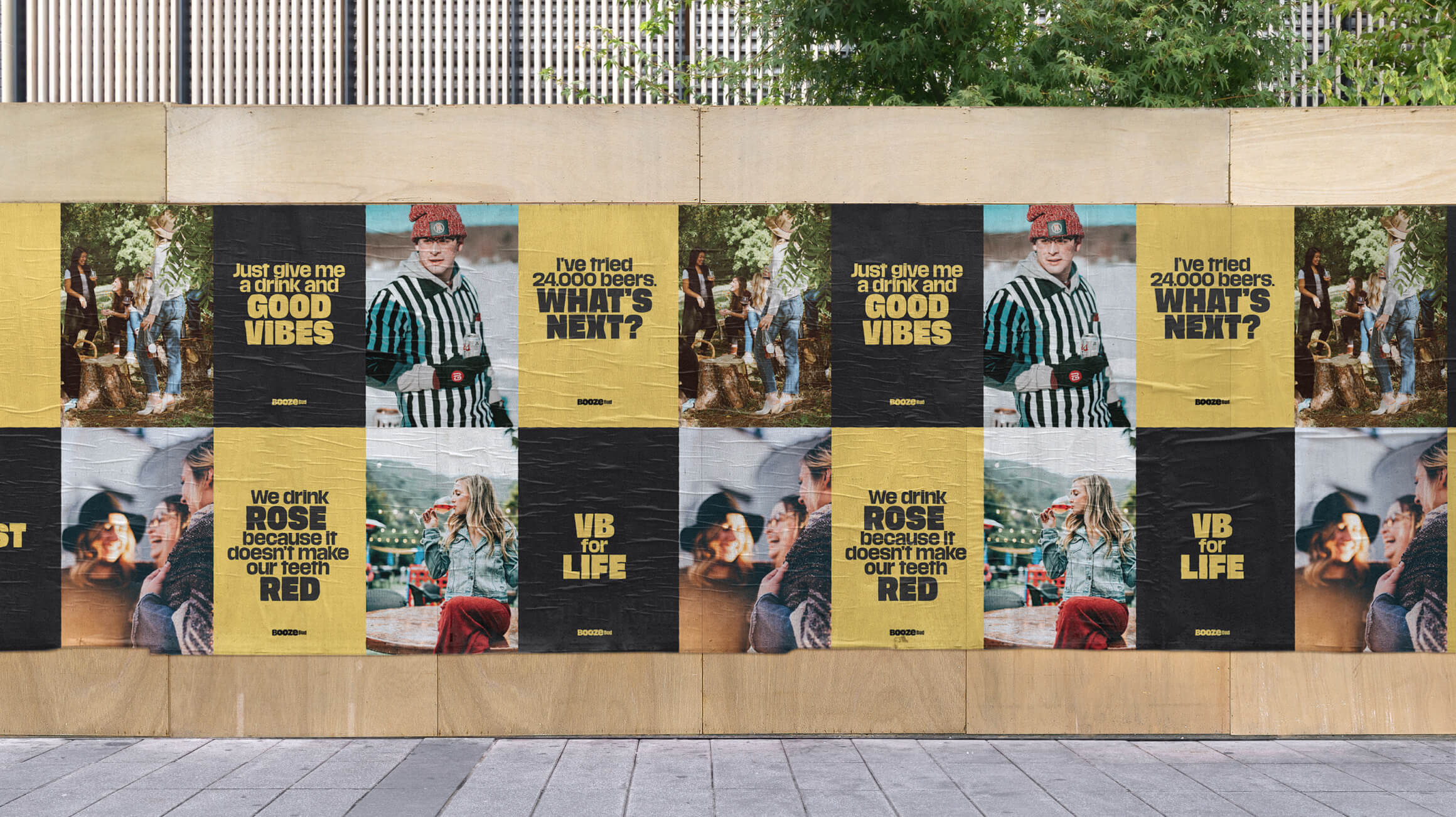
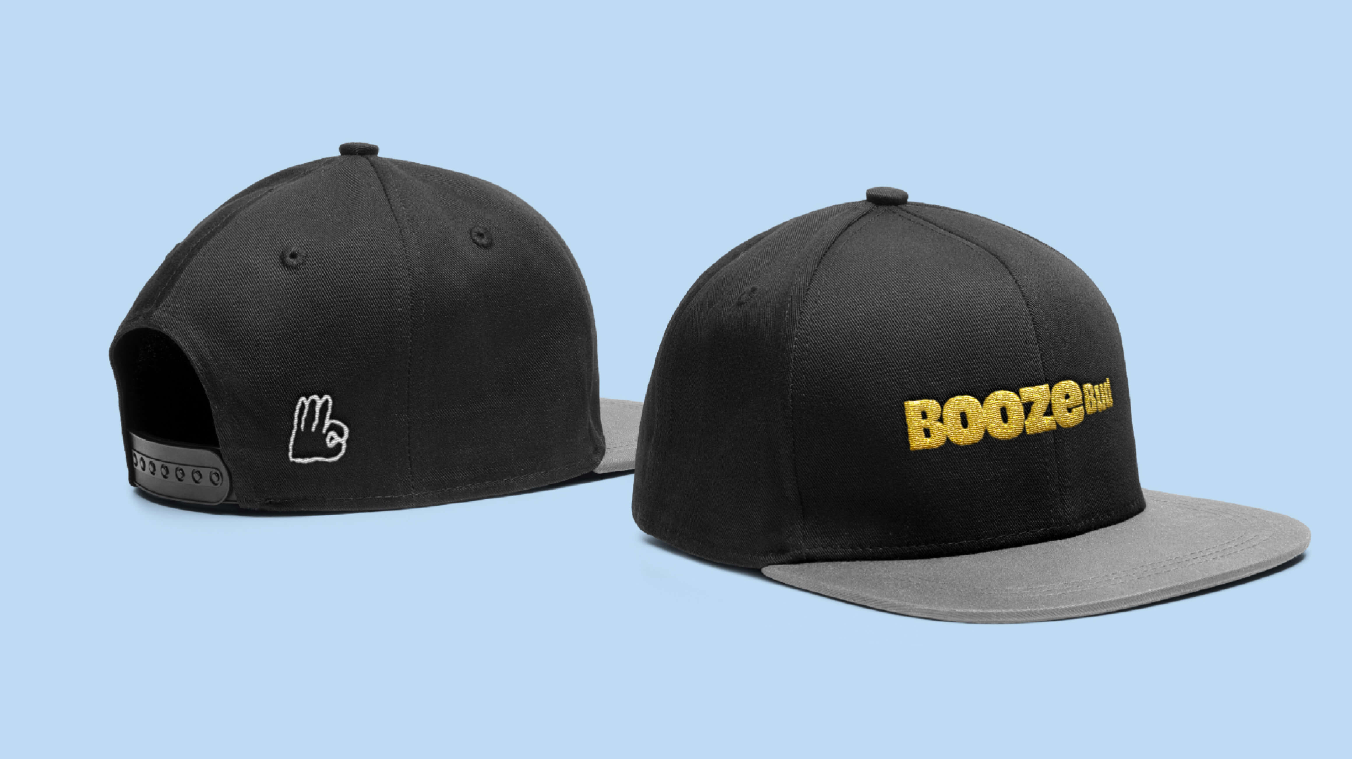
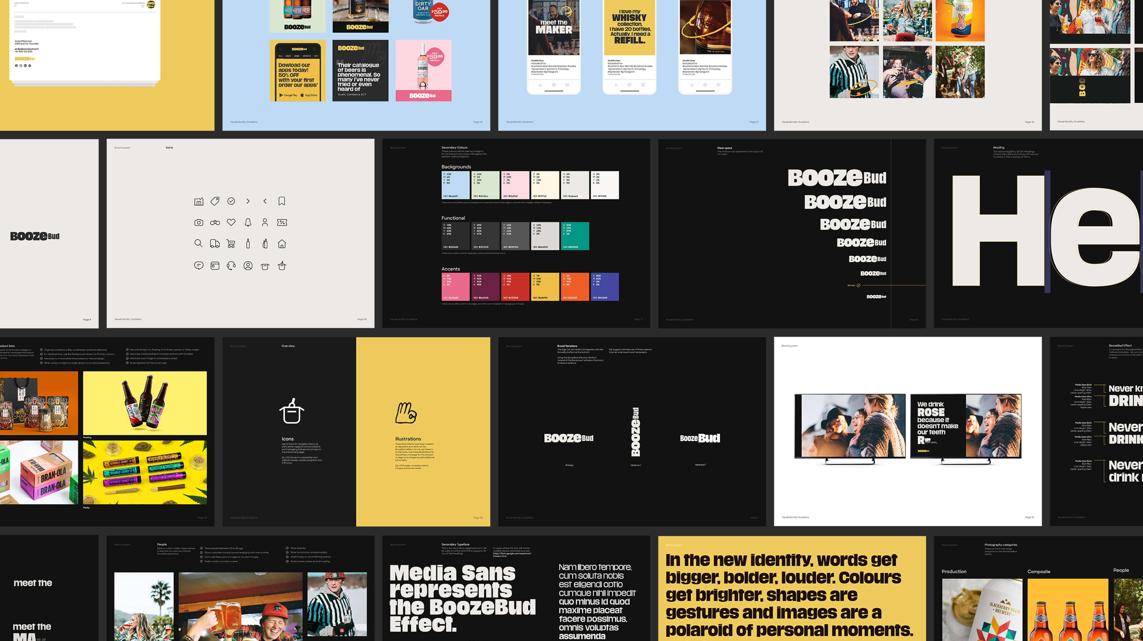
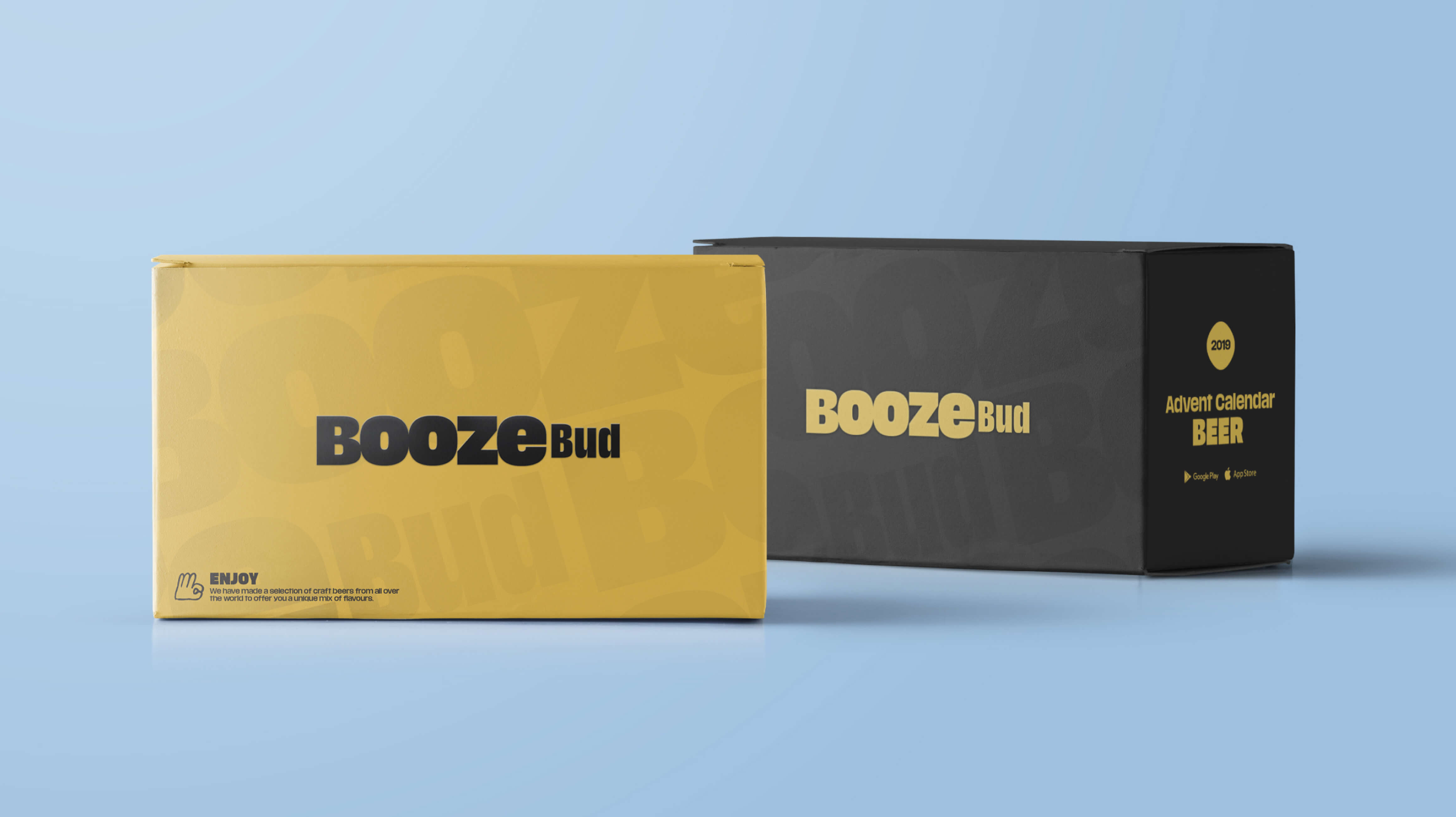
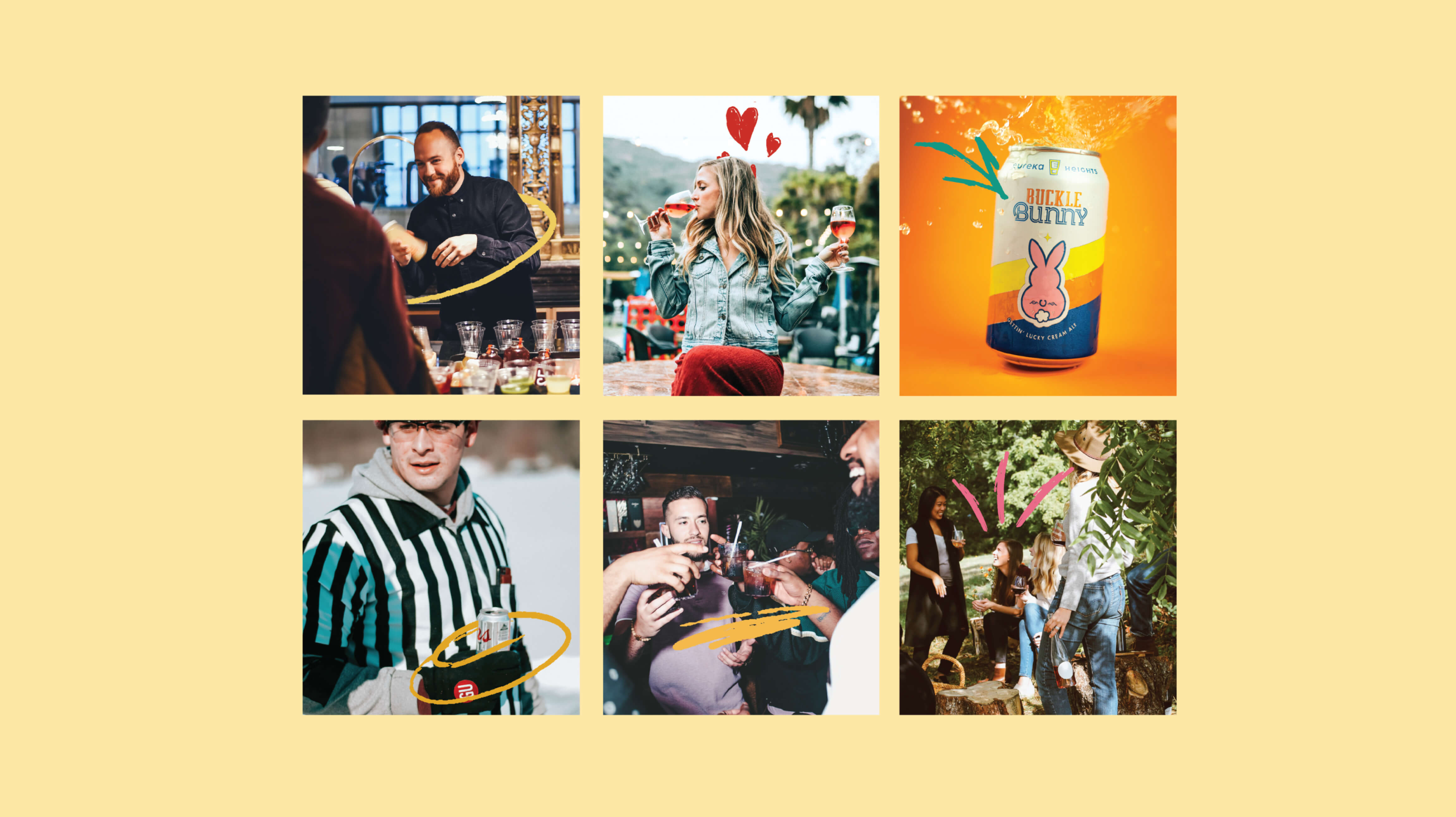
From our learnings, we knew the brand had to be welcoming, warm, and down-to-earth. Our client came to us with prior branding work done, however, the visual and verbal identity was in need of an overhaul if it was going to communicate their exceptional offering in an accessible way. We workshopped a new name. They needed something memorable, ownable, and unpretentious that reflected the essence of their offering. A name like BoozeBud. Visually, the name lent itself to the silhouette of a beer bottle. It had to be fate.
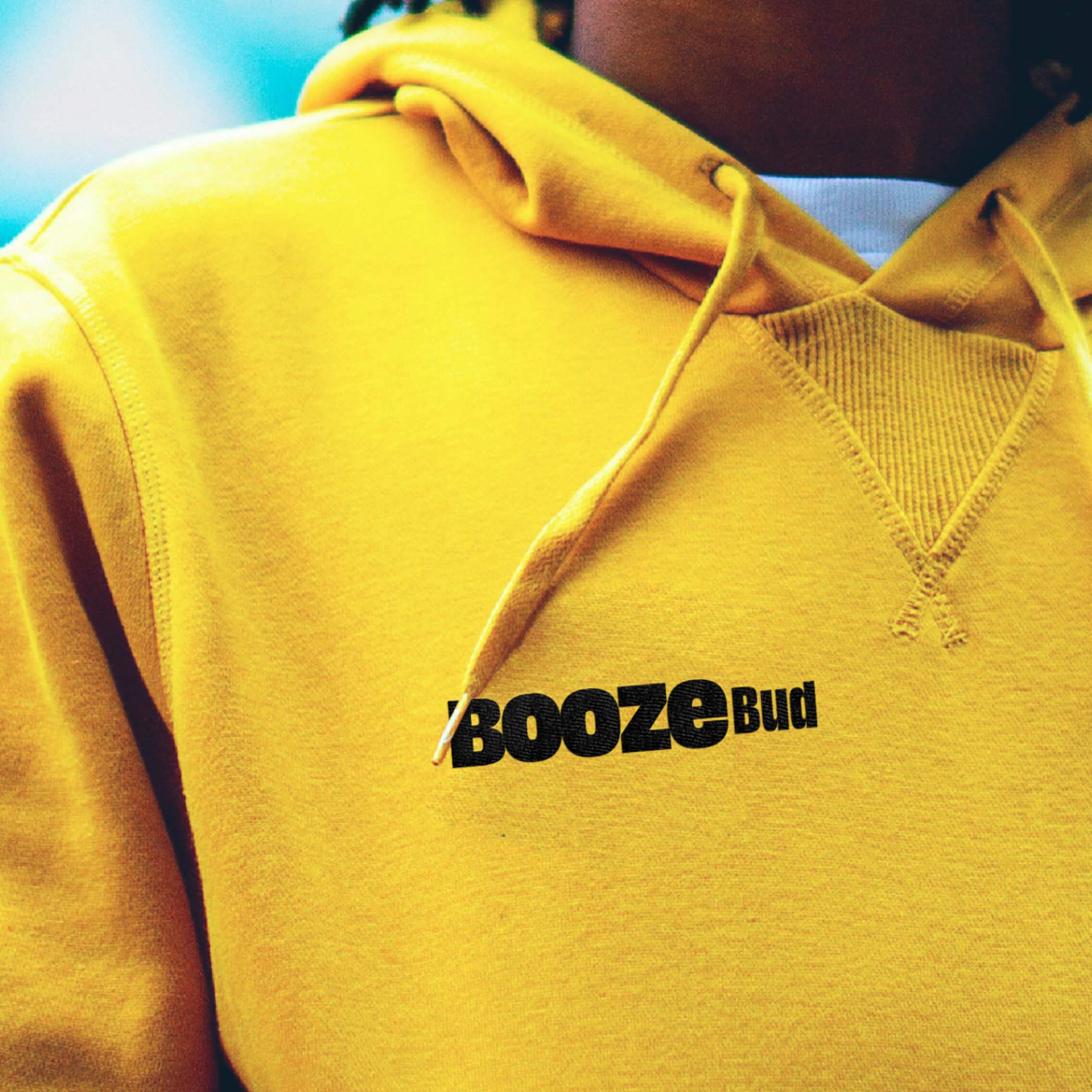
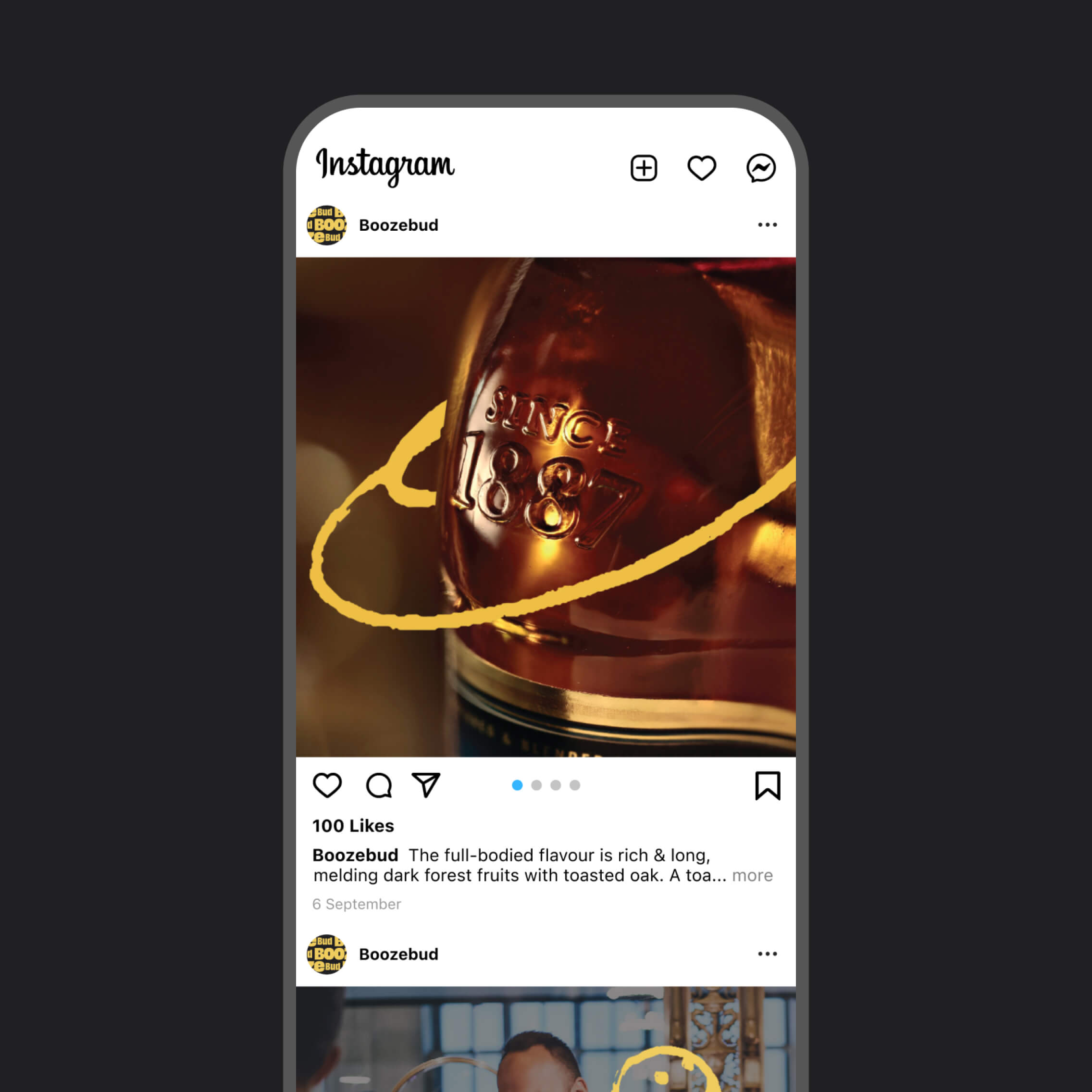
We chose a friendly, golden ale yellow, which popped atop a carbon background. Add to this a full-bodied sans serif and we had ourselves the perfect pairing. The new graphic identity wraps across every surface of the brand, from packaging, social media, iconography to environments.
03.
Communication & tone of voice
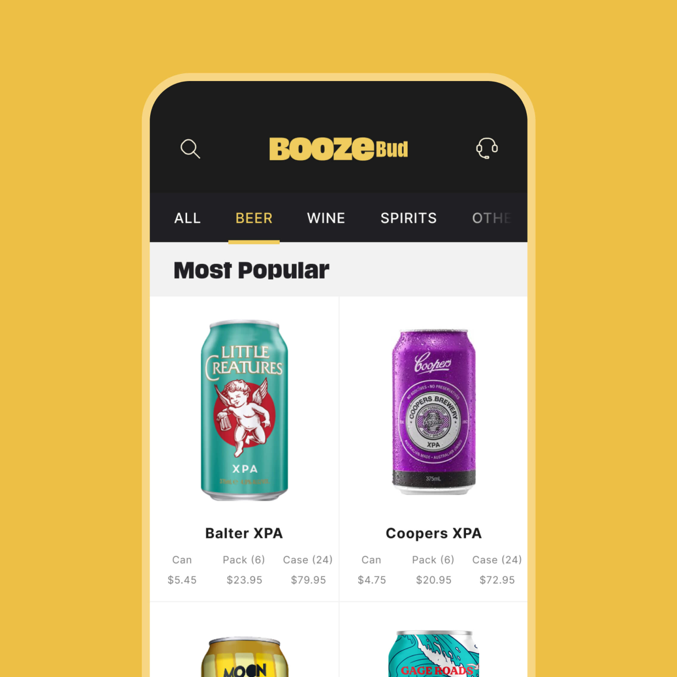
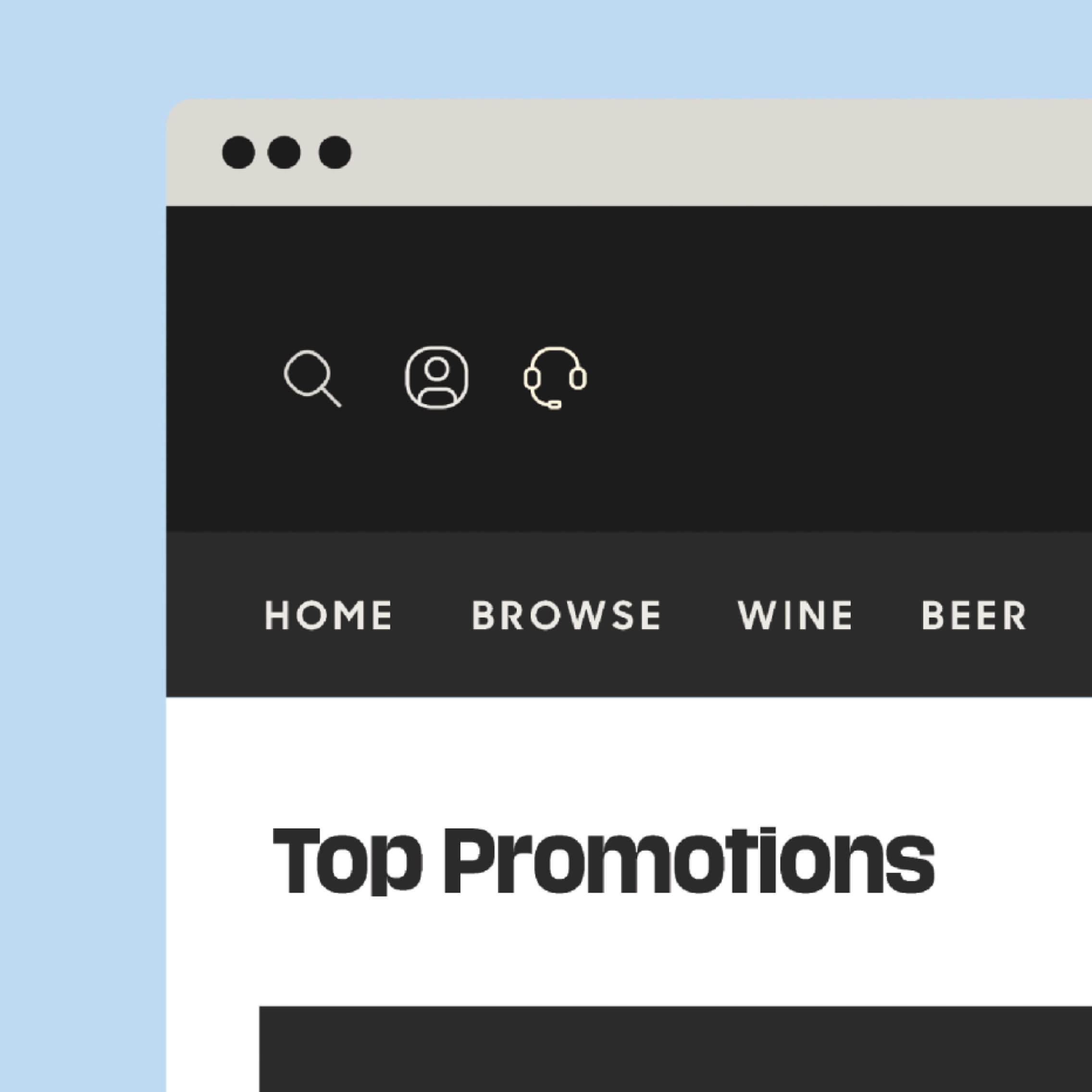
While our client was touting over 2,000 products, their point of difference was in how these beverages were curated. We had to communicate in a way that would facilitate and inspire customers to find award-winning wines, explore new spirits, try limited release beers, and more. We created shoppable categories based on key criteria that our interviewees search by, clustering drinks around specific dates, occasions, and learnings, like Father’s Day, House-warming, and Mezcal-tasting. In addition, we communicated around the offering of hand-picked recommendations tailored to the customer’s preferences. People can input what they like via BoozeBud’s ‘Get Recommendations’ feature, and receive suggestions that match.
Our aim was to craft copy echoing the cheerful banter of a knowledgeable barfly. A booze bud who’s keen for you to pull up on the stool next to them. The company has since increased its revenue by 500%, and in 2020 was acquired by Carlton and United Breweries.